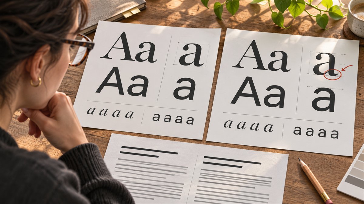
Font names are a poor way to judge a pairing. A display face can look striking in a sample word and become tiresome across twelve article headings. A body face may look elegant in a specimen but turn dense in a narrow mobile column. The useful comparison is a page fragment with the text your readers will actually see.
Give AI constraints it can check
Start with what is already fixed: a brand font, the site’s language, the kind of content, and any theme controls. Ask for a small set of candidates and a reason for each role. For example:
Suggest up to three heading and body font pairings for a WordPress tutorial site. The existing logo uses [font or visual description]. Articles contain long explanations, code labels, captions, and short buttons. The site publishes in [languages]. Prefer fonts available through [the site’s current font source]. For each pairing, explain the role of each face, likely weakness at body size, and weights to inspect. Do not claim a font supports a language or weight unless that is confirmed in the source library.
AI can help narrow the search, but font metadata must be checked in the library. Google’s font documentation says the styles and weights available for a family are shown in its listing. If a design depends on a weight or italic style that the family lacks, the pairing is not ready to use.
Compare on one realistic page fragment
Make a test page with the same words in every candidate: a long heading, two paragraphs, an H2, a short list, an image caption, and a button. Keep font size, line length, spacing, and color the same at first so the typeface is the main variable. Then inspect desktop and phone widths.
- Body text: Can you read a full paragraph comfortably, including bold text and links?
- Hierarchy: Are H1, H2, captions, and controls distinguishable without relying on color alone?
- Character coverage: Do accents, numerals, punctuation, and any required scripts render consistently?
- Fit: Does the longer real headline wrap cleanly, or does one word create an awkward line?
- Loading: How many families and styles does the page request? Google’s API guide cautions that loading many fonts can slow a page.
Pair by role, not by novelty
A useful pairing often gives the heading and body distinct jobs. A high-character display face can carry a short headline while a restrained text face handles paragraphs. The distinction can also come from weight, size, and spacing within one family. A second family is not mandatory.
If the site already has readable body typography, try changing only the heading. That limits visual drift across older posts and gives you a cleaner comparison. Conversely, if the problem is paragraph readability, solve that first; a new display font will not repair dense body text.
Make the final decision in WordPress
Preview the candidate in the site’s real theme, with its actual content width and spacing. Check a long article as well as the homepage. A pair that works in a design tool may behave differently once theme styles and responsive breakpoints apply. Record the chosen families and weights in the site’s style settings so later posts use the same rules.
