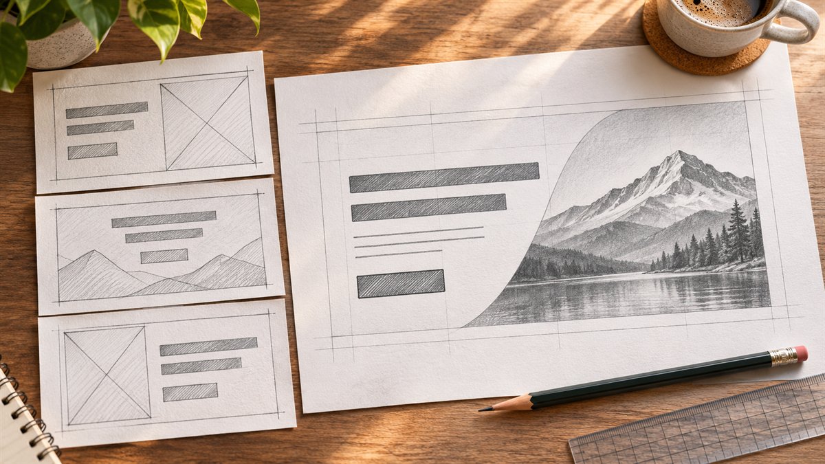
“Make a modern website hero” gives an image model little to work with. A hero is the first section of a page, and it has to explain what the page offers and what a visitor can do next. Its background image is only one part of that job.
Give the prompt a page brief
Before opening ChatGPT or a design tool, write down the page’s audience, one offer, one primary call to action, and the evidence the site can actually show. Add the brand’s type, colors, and any layout constraints. If there is no testimonial, statistic, or award to support a claim, leave it out of the brief.
Use actual draft copy when possible. Placeholder text makes it easy to approve a layout that breaks when the real heading is longer. If the copy is unfinished, set a realistic maximum length and test the replacement later.
Prompt 1: ask for a layout, not a finished picture
The following is an illustrative brief for a fictional local bike-repair business. It is a prompt template, not a design tested for a real client.
Plan a website hero for a local bike-repair shop. Audience: people who need a routine repair and want to book a slot. Primary action: “Book a repair.” Heading: “Bike repairs without the wait.” Supporting copy: “Choose a service and request an appointment online.” Do not add testimonials, prices, or same-day promises. Describe a desktop layout and a narrow-screen layout. Keep the heading and button as HTML text, identify a safe area for an optional image, and explain what should move or disappear on mobile. Flag any copy or layout assumption that needs confirmation.
The useful output is a placement plan: where the heading, supporting line, button, and image go, plus a mobile stacking order. A response full of gradients and adjectives has missed the task. Ask for a second pass that fixes the specific problem you see, such as an oversized heading or a button hidden below the image.
Prompt 2: generate an image that leaves room for the content
If the page needs an image, describe its subject and composition separately. For the bike-repair example: “Photographic workshop scene with a bicycle on the right, uncluttered space on the left for HTML text, natural light, no words, logos, badges, buttons, or invented signage. The main subject must remain visible in a narrow vertical crop.” The negative instructions prevent the image from pretending to be the complete interface.
Do not embed the headline or call-to-action inside an image. The page needs real text and a real link or button that can be edited, selected, resized, and used with assistive technology. Decide whether the image is informative or decorative before writing its text alternative. The W3C images tutorial explains that the alt text depends on the image’s role; purely decorative images can use an empty alt attribute.
Prompt 3: ask for a critique with measurable checks
Review this hero using the supplied heading, supporting copy, button label, desktop screenshot, and mobile screenshot. Identify: (1) anything that delays the reader from understanding the offer; (2) text or controls obscured by the image or crop; (3) claims that lack proof; and (4) changes needed at the narrow width. Quote the exact element you are discussing. If a contrast ratio cannot be calculated from the information given, say so.
An AI critique is a list of hypotheses. Check the actual page yourself. For normal text, WCAG 2.2’s minimum contrast criterion is 4.5:1; large text has a 3:1 threshold. Measure the text against the background it appears on, including an image overlay if one is used. Also test the button by keyboard and inspect the mobile page with the real copy.
What to reject before publishing
- A heading that describes the business so vaguely it could fit a competitor.
- A second call to action that competes with the main task without a clear reason.
- Generated text, fake interface elements, or invented proof inside the image.
- A crop that removes the subject or puts text over a busy area at phone width.
- A design that looks complete in a mockup but has no usable HTML heading or action.
AI can suggest a layout or image direction, and a design editor such as Figma or Canva can help assemble a draft. The decision is made on the working page: can the intended visitor understand the offer and use the action, on the screen they actually have?
