

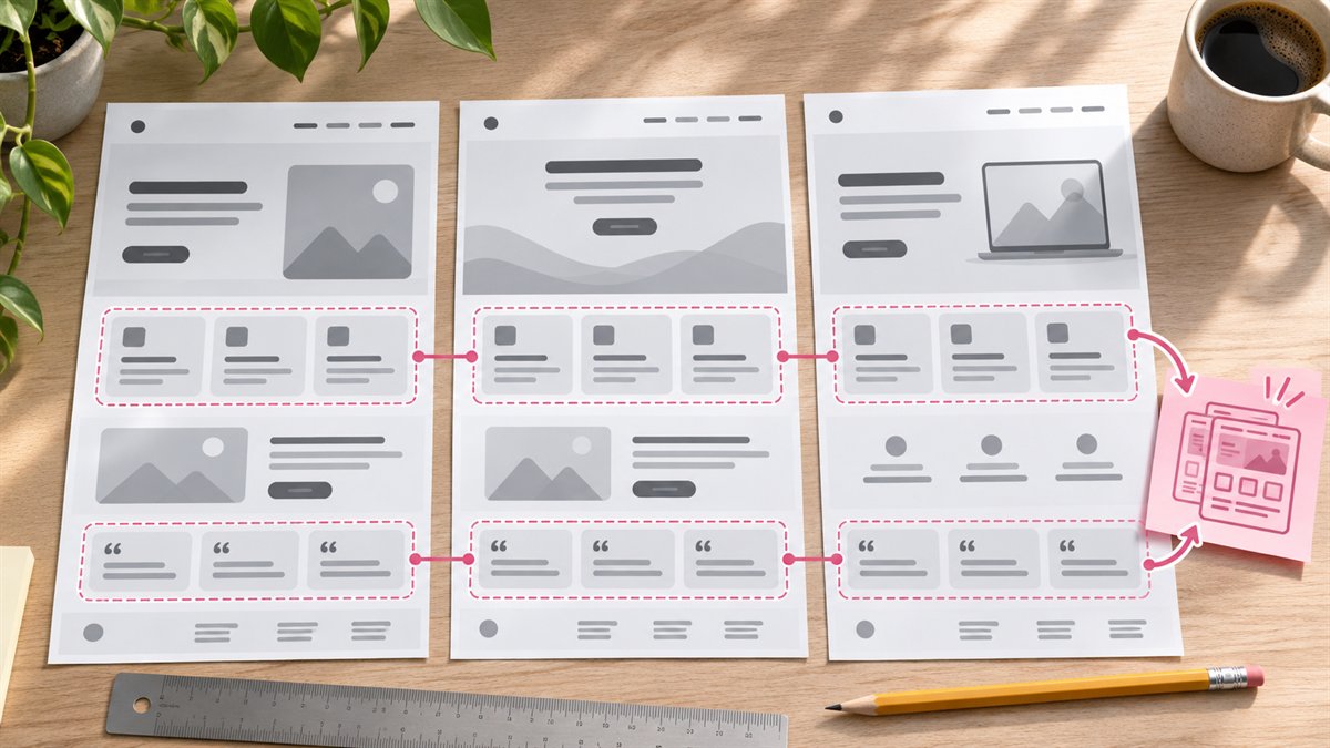
A landing page is a sequence of decisions. Visitors need to understand the offer, judge whether it applies to them, see enough evidence, and know what to do next. A balanced layout with a hero, three cards, a testimonial, and an FAQ may look complete while leaving those decisions unanswered.
What Figma AI is useful for
Figma’s First Draft documentation describes editable website and app wireframes built from common patterns. Figma says its agent is becoming the entry point for this work, with rollout and access varying by plan. The older First Draft library can assemble a familiar page shape quickly; Figma also notes it may struggle outside common patterns. Treat availability and controls as account-dependent.
The value is an editable canvas for exploring order and proportion. The generated copy, claims, and imagery still need a source.
Brief the page around one decision
Write a short brief before prompting: who arrives, what they already know, what they worry about, what evidence exists, and what action the page asks for. For example, a landing page for a local workshop booking might have a date, location, price, instructor details, and booking action. If those facts are missing, the wireframe should mark the gap, not invent them.
Create a low-fidelity landing page wireframe for [offer]. The visitor is [audience] and needs to decide [decision]. Known facts: [facts]. Available proof: [real proof or none]. Primary action: [action]. Put the answer to the main question near the top. Label each section with the visitor question it answers. Use placeholders for missing facts and do not invent testimonials, outcomes, prices, or statistics. Include a phone-width version with the same content order.
Review the wireframe before styling it
- First screen: Can a visitor tell what is offered and whether it is for them?
- Evidence: Does the page show genuine proof where the visitor needs it, or only a decorative logo row?
- Objections: Are price, fit, timing, or process questions answered if they matter to this offer?
- Action: Is the next step clear, with a label that matches what happens after the click?
- Mobile order: When columns stack, does evidence stay near the claim it supports?
Delete an empty feature card rather than filling it with generic benefit copy. If the page needs only one strong example, give that example room. If the offer is simple, a short page may be the better design.
Move from wireframe to a real page
Replace placeholder text with approved copy, check the actual source for every claim, and use the site’s real type, spacing, and components. Preview the page in the browser, not only in Figma. A wireframe cannot validate form behavior, loading, keyboard access, or the final responsive layout.
Figma feature details checked against its agent documentation on 3 November 2026.
