First, you must remember that every photo or digital artwork must have 1 point that catches the viewer’s attention. It doesn’t matter if you deal with magic (not to be confused with occultism) or surreal composition.
It can be (and mostly is) the face or the eyes, but it can also be any other spot, that is, the leitmotif of the canvas. When too many points catch the visitor’s attention, your artwork loses its charm and may lack the zest it would otherwise have with fewer accents on the canvas. So the first thing you must remember is that in art, mostly, less is more.
The second thing to bear in mind is the depth of the field. When you concentrate your look on a certain point, the rest becomes a little blurred in your vision, primarily if the rest of the objects lie far behind. This is what we call — the depth of field. In other words, the human face cannot be just as sharp in the picture as the background house that appears to be a few miles behind the figure.
Although this isn’t always true, we have different variations of art (and sometimes the unusual is the best-looking surreal concept!) In this Photoshop Tutorial, I am giving this little info so you will understand WHY we blur specific points and why we play with light the way we do.
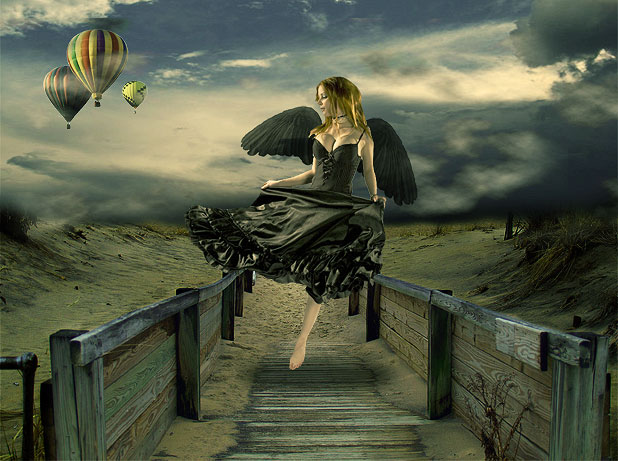

Ingredients:
http://dracoart-stock.deviantart.com/art/Asbury-Park-NJ-5-118481560
http://liam-stock.deviantart.com/art/Faballa-4-111550452
http://flordelys-stock.deviantart.com/art/sky-017-62717553
http://dracoart-stock.deviantart.com/art/Balloon-Festival-30-102183167
Get started.
We were working on a rather big canvas; we started with a 1024px × 764px new layer, as these were the dimensions of our base image. However, you may feel more comfortable working with smaller or bigger images.
Take the Image with fence and sand and paste it onto your Canvas:

Using the Rectangular Marquee Tool, crop out and delete the sky and water upper half of the layer:

Don’t worry about the rough, unnatural layer; we will work this out later.
The next step is to take the Image with the sky (from our ingredients list) and paste it on top of the previous layer with sand. Using the Eraser Tool with a small soft brush, remove the lower part so that you will have an image consisting of sky and sand, just as you see below:

The way our image looks now, it’s very far from being an organically blended scene, so let’s start combining the layers into one another.
To make the sand less cheery, the easiest way is to simply match colors with the clouds, so this is precisely what we will do. While the sand layer is selected, go to Image>> Adjustments >> Match Color and apply the following settings:

If you have already unselected, select the layer with sand again and go to Curves. Using the RGB channel, darken the Image by dragging the curve down somewhere in the middle. We used Output: 113 and Input:143.

This will give our Image a pleasant tone. The next step is to select the sky layer and go to Curves again, create a small point at the bottom, and drag the RGB channel’s curve down to make the sky darker.

Yet we got a much better-toned canvas, but still, it is very well visible that the Image consists of 2 different pieces, even if these pieces match way better in Color than before.
We will use an ancient trick to merge the horizon lines of both layers. Create a new layer and, using a big, soft brush (we are working with Brush Tool, in case I didn’t make myself clear), choose a black color and paste it over the horizon line, including the sand area outside the fence.

After you have brushed over that area, set this layer to”Soft Light,” you will have a much darker illusion as the view gets farther…

Next, we want to create an extremely mild HDR effect for the wood, so we will create a new layer above the rest of the files, but below the dark layer, we will brush it with black. Please pay attention because the sequence is essential. We will not be working with masked layers throughout this tutorial.
Once that layer is created, click on the little “black and white” icon at the end of your layers palettes, which allows you to create a new fill or layer adjustment. Select “Exposure” settings. You will have a new layer with exposure settings made:
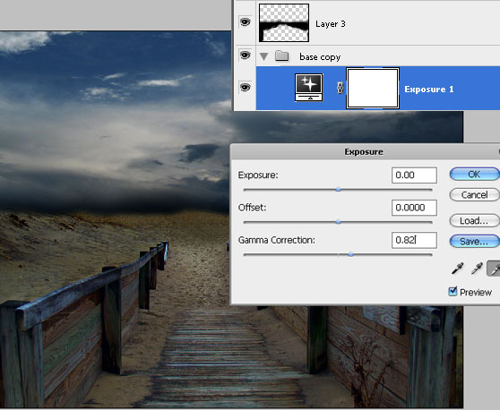
Using the “white” droplet, drag the Gamma Correction up to 0.82. See how the wood looks now as if it’s been exposed to moonlight! Isn’t it beautiful?
To accompany that bright path we the middle, create a new layer a, nd uscreate a spot in the middle ing your Brush Tool, white Color a,, nd a substantial soft brush (say, 300 pixels), create a place in the middle.

This spot should be placed above all the other layers and with blending mode set to Overlay:

Next, please take out your free stock photo with flying balloons and crop them out. Don’t worry if cropping isn’t perfect, because once you place them on your canvas, we will resize them to aa small size,, and any imperfections will be blurred naturally.

Once they are on the canvas, you will notice they look misplaced and need something to blend them nicely. The easiest solution (and please bear in mind that our tutorial is targeted at beginners) is to add clouds that will “cover” the balloons, effortlessly blending them into the composition.
So, create a new layer and go to Filter >> Render >> Clouds. With your background color set to Black and your foreground set to White (this is important!) — create clouds.

Once the clouds layer is ready, press Ctrl + T and drag the bottom line upwards, “compressing” the clouds into a smaller strap, about half the canvas. Set the blending mode of the clouds layer to “Pin Light.” This way, you will only see the WHITE areas of the clouds and won’t see the black areas.
Move the clouds in a way that will allow the white areas in clouds to lay over the balloon; this way, we can see that the balloons are floating somewhere in the area, partly obscured by the heavy sky… Use the Eraser Tool with a soft edge to remove any edges of the cloud layer once it’s moved, and you can also duplicate that layer and make a few of them, so you will have a more cloudy effect (which is what we have done).

Next, crop our beautiful Becca.
The cropping technique will not be explained here as being pretty much essential. Still, we want to emphasize that if you use our particular Image, the cropping will be rather complicated since, at some points (such as arms), the contrast between skin and background is minimal, which makes the cropping rather tricky. We had to use a few steps to complete this task. First, we used the Polygonal Lasso Tool and the Magnetic Lasso Tool, and then we “refined edges” as pictured below.
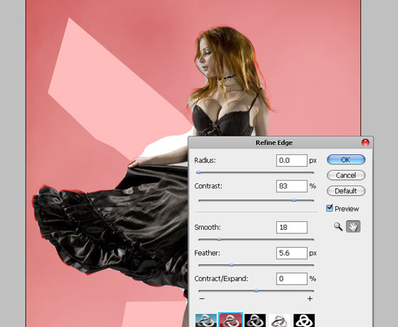
Place the girl on the canvas and seize her so she will fit in nicely.

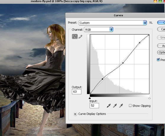
To add our contrast to the Image, we want to make the clothes texture more visible and less dark areas yet without losing the overall contrast and juiciness of the Image, so with the girl’s Image selected, we went to Image>> Adjustments >> Curves, and created a custom curve that consists from 3 points, as pictured here:
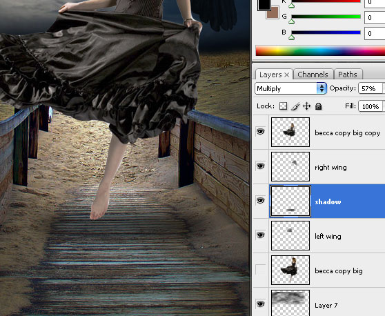
Next, we need a shadow underneath her legs. Draw a circle using the round shape tool and black Color as your foreground Photoshop color. Ensure it’s placed correctly underneath her feet and has an elliptical shape.
Rasterize the layer and go to Filter >> Blur >> Gaussian Blur

Set the shadow’s opacity to multiply 57%, and you will see that the shadow is mildly visible yet it is present and gives a more realistic illusion of jumping or flying in the air. Please also ensure you place the shadow underneath the girl’s Image!
Final Steps…
Although most of the colors we used here blended in well and eventually created an organically looking picture, we still need to equalize the layers. What some people do, and I used to do it myself in previous tutorials, is to merge all the layers or even flatten the Image and then work on the colorization and the levels. This is very easy and perhaps will do the trick with most beginners, but even if you are not yet that much of a pro with Photoshop, you need to learn how to work with Layer Adjustments.
In your layers’ panel, you have a small icon below that looks like a Yin-Yang symbol.

Create a new layer on top of all the other layers, and click this icon; you have a menu with various options; select “Photo Filter” first.
Use the default “Warming Filter (85), which I think is best for any picture if you want a quick and warm effect, and set the Density to about 25%. The rule of thumb is that if we use warm colors such as brown, pink, and earthly shades, we will give our composition a warm feeling (which is our aim here!); however, if you want to make your outcome look colder, dreadful, dramatic and morbid, use shades of blue and green.

Once this is done, you still have a layer selected that is on top of all the others; click the Layer Adjustments icon again, determine “photo filter” one more time, and this time apply a plain yellow color filter with 48% density.

Most of you might want to stop here, but we want to make this Image look fabulous, so we click the Layer Adjustments icons again; this time, we pick the “Curves.” This will apply the Curve settings to ALL the layers underneath these settings, which is a massive advantage as you need not go layer by layer.
Make two points that will brighten up the Image quite dramatically. Note that we are working with the RGB channel.

Now, the final touch is to give our composition a light, lightly cold touch; as we spoke before, a bit of green hue will do this trick. So yes, we will again click on the Layer Adjustments and select the RED channel. Darken the Image a bit, using two points…

That’s it! I hope you enjoyed the tutorials, and please feel free to download the PSD file for learning purposes (1024 x 764). You can also replace the model of our tutorial with your Image, and you will have all the effects already in place. Click on the image below to view it fully.

Once you purchase the PSD and complete the checkout, click the “return to merchant’s website” button, and the download will start automatically. If you have any problems, please comment below, and I will email you the file within 24 hours.




Very nice the tutorial.
for ever I love u
Namasthe!! its realy helps to fresher designer, i will try this
thank you
i think same like u. it was great tutorial 😀
Nice tutorial! I really like your attention to lighting and vanishing points.
Thanks Tom! 😉
i saw u r blog.nice tutorial
Am I missing something, or did you forget the wings? I can’t find either the picture or at which step you added them.
Sorry if I missed something.
No, you are not missing anything, I DID! lol, please see my comment above about that step 🙂
thank you so much for writing this tutorial. It is really easy and it taught me some new features, like the match color option and the painting of black on a new layer to make the picture darker in areas. Great job!
thanks for the feedback!
lol, I don’t see the ‘wings’ layer either. But this tutorial is still handy, even if you learn only one thing. Which I did, the steps to make the shadow underneath will save me a lot of ‘undo’ moments. It’s an “Ah-ha!” moment for me. So thank you. I enjoy your tuts, they are exactly the things I’m looking for [[fantasy art]]. Please keep sharing!!
thanks Tiffy! Looks like I have indeed totally missed the wings step, damn. Basically these are brushes with wings which I added, I already explained this step (didn’t forget) on my other tutorial so you can follow the details about wings there, which is pretty identical except that here they are black and not white.
https://loreleiwebdesign.com/2009/01/10/dark-fantasy-art-photoshop-tutorial-fairy-sunset-landscap/
and here are the brushes:
http://www.deviantart.com/deviation/11925788/
Glad you liked the shadow part, always good to be helpful 🙂
u blog is beautiful.
Yeah really this is awesome
this is really amazing work, do you do album covers?
Looks nice, although it’d help your workflow if you started using masks. Don’t destroy pixels with the eraser tool, there’ll come a time when you need them back 😉
Danny
Daniel Meadows Retouching and Digital Art
interesting stuff.. i gonna use these. thanks. 🙂
Paid through paypal – never got the file. What gives?
Hi, thanks for the purchase! When you hit the “return to merchant’s website” button, download should have started automatically, but if this didn’t happen, you should have in any way received an email with auto response saying that if you haven’t received a tutorial, you just need to send back a response and it will be emailed to you.
Anyway, I just checked your email here and located your purchase on PayPal, so the files were emailed to you, please check your inbox 🙂
Never received the file via “automatic download” and the tutorial never mentions the steps for adding the wings. Awesome! . . .eh, not so much. I want my dollar back.
Come on, you are not done with the person in this photo soup. Nice work on the picture though…
please send me this file by email because I coud’nt download it
Thanks for your purchase, I just sent the files to your paypal email.
Great tutorial. THANKS from Holland
It’s always a relief when someone with obvious epxrestie answers. Thanks!
CyPsFo fvaybnbgnsgw
9sIsdg csjfketpxspq
Just wanted to say thanks for this post!
Your blog is an awesome resource! Pretty sure you are going to have a good read
https://www.colblog.com
Cheers,
Great tutorial !!
hello,everyone, i am the new member here
Hmm is it just me or do this tut not tell what to do whit the wings on it :S?
awesome tutorial.
one question: which version of photoshop is the tutorial for? sadly, i’m unable to select “exposure” via the “black and white circle” on the layer palate (create new fill/layer) since it is missing from my CS2 version of photoshop. any tips?
Impressive piece of art work the final result. Pretty good tutorial!
I have been using the Autum Web template that used to be at http://www.loreleiweb.com/forum/showthread.php?t=4328 for the past three years in my beginning Web Design class. Now I can not find it. Can you direct me to where it is at?
Thank you,
Dan Getty
Battle Ground High School
Great tutorial…
like it a lot
Really nice! 🙂 just finish the tuto and looks great 😀
I the end result and i appreciate your work and the lady in the photograph.
Really good work and inspiring me
fantastic! thank you very much for this tut!
Beautiful picture it is nice to see artist share how their work was created. I’m a Corel user but its just a matter of translating it.
you are really amazing artist..and its good to see artist sharing how best work can be done…thank you very much..I am also update my collection please do check…www.websitedevelopment-india.com
Nice final image and a good tutorial !
I’m glad I discovered your site 🙂 I think I’ll write some tutorials for you (and I hope you’ll like them).
Awesome. I really liked how the final outcome looks. It looks really polished and surreal and mystical!! It serves as an inspiration for my logo actually. I tried using this concept on my logo but it somehow looked a little bit “off”. Haha. I can’t get it to look as good as yours. Gave up after trying for days. Finally decided to use the professional services of an online logo design site instead after googling for one (http://www.logodesignplanet.com) and finally got the logo I wanted at an affordable price and fast too. I did show the designer the link to your site to explain how I wanted the logo to like. Lesson learned. I’m not going to design a logo without any professional help although it’s somewhat fun. Anyway, thanks for the cool tutorial…
Really nice work………
Hello Friend…..
I Really Impressed To Watch Yout Tutorial.First Think I Like Your Design Not Even In Single Blog All Site Design & Template Is So Good.
I Need More Design,Templates,Banner Ads Design,Logo Design,Web Design Template And Many More.
So Keep Sharing……..
Thanking You.
Nice tutorial…
like it….!
HI !
Cool effect I will certainly be useful to my new project.
Thanks
i’ve even won for a photo of a day with this tutorial
tnx aloooooooot!
http://www.fotosofia.info/Fotka.aspx?type=halloffame&id=40716&isnatjecaj=0
I paid for a PSD copy of Design Surreal Composition Fallen Angel’s Dream Fly file on paypal this morning and it did not let me return for the download.
Don Reeder
Wow great posting! Thanks for sharing.
good tutorial. I like your step by step posting. Thanks.
Great site. A lot of useful information here. I’m sending it to some friends!
I was inspired by the effect. It simply looked awesome. I did give this link to my graphic designer from LogoDesignStation as a reference to how I wanted my business card to look like. Surprisingly, the design came out better than expected! It was really good all thanks to you! Even my friends were impressed…
Still have not received my PSD file!
@Don, I emailed you now, sorry for the delay. I looked up your email and i can’t find your purchase ID though.
If anyone else is experiencing a problem with download (which in most cases starts automatically), please email me editor@loreleiwebdesign.com — this is the fastest way to get a response.
Thanks!
how do you create something like this
out of a given picture?
amazing photo montage techniques in this beautiful tutorials.
Still no PSD file and I emailed you a copy of the Pay Pal transaction. By the way I see no mention of the creation of the wings in the tutorial.
Don Reeder
I’ve recently started a blog, the information you provide on this site has helped me tremendously. Thank you for all of your time & work.
Very nice post. best regards
I have attempted to leave a comment on this blog but every time I try the form times out the screen or provides an error. Can the author could possibly check into why it keeps messing up?
Hello, Does anyone know the blog TutoTop? Looking for a tutorial on usenet, they told me there was one interesting! Thank you in advance!
Hello, Does anyone know the blog TutoTop? Looking for a tutorial on newsgroups, they told me there was one super! Thank you in advance!
Really helpful tutorial for graphics designer.
Beautiful work and very helpful
In the seventh image I very confused
.. can you help me please?
and to become more clear
because I do not know English well
And I am new to photoshop. Thank you very much.
This is the best tutorial I have ever seen. I sent in the money like you asked. Thanks for making my day. Freddie J. Smitty
Hello , i am new in your site and I can not understand because I’m very beginner.
why my own clouds are black and not white? What to do?
What a great resource!
Thanks, really good tips…
Hello,
I just pay for the PSD, but the download don’t start.
PayPal-Transaktionscode
12990497TJ4667743
Please send me a link.
Yours
A.Paul
Paul – sorry for the delay, I emailed you the file now, thanks and enjoy!
For me personally, this has already happened. Phone, internet, and TV come out of the same small blinky box, and are all accessible through my computer. I have different hardware on the ends of the cables, but the fact that it all comes from one access point pretty much signals the end of differentiation between devices.
Basically, I have a “home device” and an “away device”, and the only difference is the size of the screen.
.
Awesome Tutorial!. Well, do this website have tutorials on making human into monster or a Goddess or a warrior. Please reply asap. It is for a school project.
I’ve always been interested in working with wings, and I’d like to add wings to my own version of this piece. However, I don’t seem to see the part of that in your tutorial. Could you possibly email me how you did that? My email is demonamelia@hotmail.com Please and thank you! 😀
Thanks for a great few hours well spent, I’m tottaly buzzing now I’ve just finished my first real project. Bring them all on, I’m hoocked
Creativity at the best level
hi…………..
it was great experience I had before…..
I am beginner I grasped very much
It is really a great collection of nice photo shop…keep it up this great suggestion.
Thank you very much for the information great post, found it on Yahoo.
I was able to downlod the file, but it was corrupted and would not open.
very nice programe
i want this file for enjoyment the photo
Wow!! wonderful tut, and wonderful style of work 🙂 carry on sky is the limit.
Excellent work.
Hi I just pay the PSD file but It dint download
Unique Transaction ID #2HV936570P979233G
Please send the link
Thanks
nice tutorial & design.
Link building development is an essential online strategy that provides you the maximum link
Hi, Thanks for the info. I love the tutorial.
Very nice the tutorial and thank you
I’m trying to find a photoshop tutorial that features a dark (almost black) face with bright eyes… and keep getting linked to this tutorial. Can you send the link to the face & eyes tutorial? Thanks!
Nevermind… found it on the website… Thank you for the tutorial!
Wow, amazing weblog structure! How long have you ever been blogging for? you make running a blog look easy. The full look of your website is fantastic, as neatly as the content!
Thanks for tutorial, very useful!
Great tutorial !! Thanks for the
Great tutorial !! Thanks for the
I think that is one of the such a lot significant information for me. And i’m satisfied studying your article. However want to remark on few normal issues, The site style is great, the articles is in point of fact great : D. Just right task, cheers
It’s actually a peculiar as well as difficult approach to point out that, I do believe. But you are seeking the perform guide or even a character reference correspondence, one that is by now written. Exactly why these people specify pre-written I could not point out…
Great information guysmuch appreciated particularly at what im seeking to do.
Does anyone have any even more reading? Where is the best place to get started on here on this website?
http://workwear1011.blog.com
Great information guysmuch appreciated particularly at what im wanting to do.
Does anyone have additional reading? Where’s the best place to start here on this website?
http://painterssydney1010.webstarts.com/painters_sydney.html
Great information guysvery much appreciated in particular at what i will be seeking to perform.
Does any person have any additional reading? Where’s a good option to begin here on this web site?
http://www.kaboodle.com/blogs/painters-auz/painters-auz
Great information guysmuch appreciated in particular at what im attempting to perform.
Does anybody have any more reading? Where is the best place to get started on here on this web site?
http://my.opera.com/excavationsydney/blog/
Thank you, sure I will practice your steps, the final result looks great. Very useful.
Great information you provide. Exactly why these people specify per-written I could not point out
not setisfied
Where is the reset of the tutorial at???
I thought the image is suppose to look like this:http://media.smashingmagazine.com/images/space-sky-tutorials/moonlit.jpg
Good! Very nice ! I’m very like!
I just started to learn web design, find it very interesting, especially the foreign pages, it’s style and layout I really like it. So would like to take your website to know more foreign friends, I hope my wish can be realized. This way to make friends, and secondly to improve my web design ability. I hope I would like to know friends and want to know me feel free to contact me: yongrui2404@sina.com. Almost forgot, I am from China! Thank you!
Im Handwerk gibt es einen neuen Trend: Auftragsbörsen wie My-Hammer. Dort können Interessierte ihre Aufträge einstellen und erhalten Gebote.
Handwerker mit zu wenig Aufträgen können dann Aufträge entgegennehmen. Danach Bewerimg.
Wie findet Ihr das?
Gruesse
Euer handwerio
Good! Very nice ! I’m very like!
i want this file for enjoyment the photo.
Thank you, sure I will practice your steps, the final result looks great. Very useful.
I did not see the part where you add the wings? I am a beginer, and was looking forward to that part. Could any one help me? Other than that one of the best detailed tutorials I have ever read!
Wow! Very nice ! looking Great.
Great trick, I will follow your steps, just needed an image like this one, thank you.
Greetings
Dear Lorelei , thank you for the useful tutorial, even a novice like me can follow your steps and get a professional final results. Thanks from Peru.
I payed by PayPal but I got a message that de zip-file didn’t exists.
Please send it to me by email
Thanks in advance,
Michel
woo
Creativity at the best step. I will practice your steps, the final result looks great. Very useful. thnks
Excellent Tutorial. Do you have any tutorials using the Gimp software?
My dream girl is angel. Liked it and appreciate for a nice design.
Nice work on super real composition. It creates magical effect. Thank you for sharing.
Excellent work. I’m really appreciate for this design. its really creative work.
Excellent Photoshop work. And also useful & helpful post. Thanks
cool and very helpful.www.cute-it.com
Magnificent Tutorial!. All things considered, do this site have instructional exercises on making human into creature or a Goddess or a warrior. If it’s not too much trouble answer asap. It is for a school venture.
excellent design, thanks for such a very nice design, highly creative plus informative, thanks for sharing with us, really very helpful stuff.
Highly creative design, thanks for such a very nice tutorial, excellent stuff, thanks a lot for sharing with us. keep it up.
You provide details information about editing. Its really helpful to me and also Nice Work and Fantastic Tutorial for people want to learn Photo Editing and interested in Graphic Design.
It’s really nice tutorial. Anyone can learn this thing easily form this tutorial.
Thanks for such kind of tutorial.
It’s really great and highly creative tutorial. Really easy to practice. thanks so much. I love it.
Nice tutorial admin, very love it. Can i try?
Thanks! Your guidance and tips are important and we appreciate your efforts for sharing this great information.
Hell guy,
Creative things you have made and shared with us . I’m impressed after seeing this post . Keep continue sharing such nice post .
Nice tutorial, thx 😀
this is really amazing work, do you do album covers?
Awesome!Thanks a lot for this effective tutorial.
Useful and informative post you have shared with us on public . So much thanks for this posting . Remvoe White Background | Clipping Path | Product Photo Editing
Amazing things here. I am very happy to peer your post. Thank you so
much and I am taking a look forward to touch you. Will you kindly drop me a mail?
Great trick, I will follow your steps, just needed an image like this one, thank you.
Greetings.
Thanks for such a very nice trick. Really amazing graphics design tutorial. Thanks for sharing with us. Very helpful. keep it up man. Really very nice try.
This effective tutorial.Thanks for tutorial sharing it with us.
This Design tutorial is very nice and helpful. The quality content you have published it is useful.
thank’s for your article, great design tutorial hope i will try this.
Magnificent Tutorial!. All things thought-about, do that website have educational exercises on creating human into creature or a immortal or a person. If it’s not an excessive amount of bother answer ASAP. it’s for a faculty venture
Nice photo manipulation tutorial. It was really so helpful for me. Thanks a lot for sharing with us
First of all thanks for sharing this article i also bookmark this page its awesome .
First of all thanks fro sharing this article its great information. Nice post on Manipulation
This is the first time I am visiting your website. Your all post was just too good with a lot of information. Many many thanks for sharing with us.
Thanks for sharing the article regarding design communication. The quality content here you have posted it amazing and interesting. Keep it up for composing fresh content.
Lot of Photoshop tutorials I have read on photo manipulation. I am really impressed to this tutorial. I just want to include one thing “Without excercise, practise and experience, the talent is of no use” and You did it. Thank you.
I must thank you for sharing this useful topic. Really a worth reading post ! it explains it all so easliy ! thank you for sharing this article !!
wow. Really nice Photoshop.
I have read the entire article. This tutorial is informative. Anyone can learn from this tutorial even if they have very little knowledge about it. So thank you very much.
Thank you for sharing this article. Great post for manipulation.
Really a helpful post forever. I believe that it will help with my next project.
Goog Job! I love to read this post. Thanks for Sharing this cool article.
it’s very informative post I have learned many things from this post
Hi there friends, how is the whole thing, and what you would
like to say regarding this paragraph, in my view its in fact remarkable in support of me.
nice tutorial thank you for sharing, I am still learning about this
Wow, outstanding post. Many many thanks for sharing with us. I request you to post more on this topic. Thanks
wow, nice post dude, i have learn something new 🙂 thank you
What a fantastic tutorial. Many many thanks for sharing with us.
So amazing angels design. Great work and experience share this post. Thank you so much.
Good describe here you have written . After reading i appreciated your post . Thanks you and keep continue .
Thanks for sharing this article, i learn nice information from your article.
The blog and best that is extremely useful to keep I can share the ideas of the future as this is really what I was looking for, I am very comfortable and pleased to come here. Thank you very much.
I really enjoyed your blog Thanks for sharing such an informative post.
Amazing design in your expertness, extremely very to designer. Very briefly describe here you have written,Thanks.
Thanks for sharing good blog post about the trendy bloggers, who’s making millions of new audiences also appreciate for the article which you shared with us.
I always look your website for new update. Go ahead….
Great tutorial really nice
This is relay great quality article. Thanks for updating our knowledge because it helped me a lot.
hello guys
Many wonderful posts You have done many creative works.
I’m happy to see the work.
What a manipulation works and the tips of your editing process is really great and very helpful to me. Keep sharing like this post more with us. Thanks.
Amazing Job! Thank you for sharing.
Intriguing articles respecting medicament and produts
Hi there this is somewhat of off topic but I was wondering if blogs use WYSIWYG editors or if you have to
manually code with HTML. I’m starting a blog soon but have no coding skills so I wanted to get guidance from someone with experience.
Any help would be greatly appreciated!
Your artwork just awesome.I am very much inspired.Your tutorial helps me as like my Teacher. Thanks for your website to know us in valuable work.
I gathered lot of information regarding graphic design from the resourceful blog. An awesome effect applied in the work. I will certainly be useful to my new project. I appreciate your dedicated work. Thanks once again for writing such article.
Thank you so much for sharing such amazing information, it’s really unique and valuable also.
Amazing post, thanks for sharing this article. I am truly motivated by you for blogging.
Thank You
WOW!!! that’s a really informative article, I am very much inspired. Your tutorial helps me as like my mentor, i am looking forward to more informative article form you.
Hello Dear Guys,
I am see your website and i am happy to see your creative design.I am gathered lots of knowledge for your website.Thank to all the web members shearing this helpful website.
Excellent article! This post is very informative and useful also help me a lot. Thanks for sharing.
Great and mind blowing design quality. I appreciate your post. Thanks for nice posting. Keep it up.
This is my first time, I visit here. Thank you for sharing an awesome article.
I have nothing to say about this post that you share here, thanks
Thank you so much for this site.
Great and mind blowing design quality. I appreciate your post. Thanks for nice posting.
The stuff you are using that is very useful and helpful.
I am always searching for quality posts & articles & this is what I found here, I hope you will be adding more.
very nice article it is very helpful. great collection and a lot of good inspiration for getting better final results Helped me getting even more beautiful shots. Thanks for sharing!
Great Designing work, I appreciate your designing task, Thank you so much for share your informative blog with us.
I have nothing to say about this post ….It is outstanding…….thanks a lot..
NICE POST THANKS FOR SHARING THIS ARTICLE.
Very nice image manipulation. Thanks for you nice tutorial.
better than, any other video tutorial, i think girl wing is little bit short, but overall perfect. thanks for sharing and your hard work also.
Hi Lorelei,
Thanks for sharing nice article with us.
Thanks for putting in much effort for this information.
amazing picture design. I hope I can do it too
Outstanding design. Thanks for share this post.
Making his foray into this genre with Laal Ishq, the talented actor, comedian and singer will soon be seen playing the role of a famous ventriloquist. Shedding his comical avatar, the actor will be part of a spooky story that will leave the viewers in jitters.
An awesome article about manipulation. the final result was really excellent
Thankyou for sharing this article and amazing pictures. !!
Decent, in spite of the fact that it’d help your work process in the event that you began utilizing veils. Try not to crush pixels with the eraser device, there’ll come when you need them back
Great and mind blowing design quality. I appreciate your post. Thanks for nice posting.
Much obliged for sharing this article, I take in decent data from your article.
Very impressive … Adobe Photoshop is a very popular image designer and image editor. Photoshop has become so dominant that you can use its name as a verb.
very nice .it work for new photo editor
Very impressive. Thanks for sharing
Amid speculation over contestants for Bigg Boss 15 being finalised, a source
from the Colors Tv channel is launching soon bigg boss 15 watch online live.
Your Image Manipulation work is really so good. It is really outstanding. I appreciate your designing task and design work. Thank you so much share this.
Warm Regards
Silo Path
Your website is Very Good, Your All Article Are Knowledgeable I
Want To creat A New Website On Bigg Boss 15 Like as your Website.
I am impressed by the details that you have article. Thank you for taking the time and sharing this article. It was indeed very helpful and insightful. A good informative post that you have shared and thankful your work for sharing the information. I appreciate your efforts and all the best.
ammazing work done by you i am also working to do amazing work like you
Wow so informative. I have learnt a lot from here. keep going. Need to read something like this more.
This tutorial very helpful.
WOW!!! that’s a really informative article, I am very much inspired. Your tutorial helps me as like my mentor, i am looking forward to more informative article form you.
beautiful.
amazing post. thank you very much for sharing this great information. it really brings the people together nicely. thanks again for this great source.
very good post. tkank you
I highly recommended it. Your Image Manipulation work is really so great. It is really outstanding. Thanks for sharing
its so awesome gals