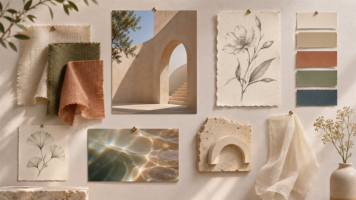
A mood board should help a team make design decisions. A collage that only looks cohesive can hide the important question: which qualities suit this project and why? Pinterest makes references easy to gather. AI can help name patterns in your notes. Neither step determines the final design.
Collect references with a reason attached
Start with the page’s purpose and audience. Save a manageable set of references for separate questions: typography, layout, color, imagery, and interaction. For each one, write what you are borrowing as an idea. “Clear hierarchy between a short heading and supporting text” is useful. “Make it look like this page” is not a design brief.
Keep the source link and creator information with each reference. A Pin may lead to a portfolio, a shop, or a repost; trace it back before treating it as an example of a particular designer’s work. Pinterest’s copyright guidance says it cannot identify the copyright owner of every Pin and that permission may be needed to use an image. Saving a reference is not a license to republish it in a final asset.
Ask ChatGPT for patterns, not a copied style
Write short observations in your own words, then use a prompt such as:
Here are my notes on visual references for a [type of website] serving [audience]. Group the observations into typography, spacing, color, and imagery. Identify any contradictions and ask which choices depend on the site’s content. Produce a short design brief with two directions and one risk for each. Do not name a reference as a style to imitate, invent brand history, or claim that an image is licensed for reuse.
The output is useful if it exposes a choice. For example, a dense editorial layout may suit a magazine index but make a booking form harder to scan. A pale palette may look calm in a board yet fail when used for body text or buttons. Test the proposed direction on the actual page content.
Turn the board into design rules
- Type: Describe the relationship between heading and body text, then test real paragraphs.
- Spacing: Name where the design should feel open or compact, rather than copying exact measurements from a reference.
- Color: Assign roles to colors and check contrast in the page.
- Imagery: Specify subject, crop, and tone. Use original or properly licensed assets in the finished work.
- Avoid: Record visual habits that conflict with the project, such as decorative gradients behind long text or a collage that obscures the main action.
Build one small test section from these rules. If it communicates the page’s message and works at phone width, extend the system. If it only resembles the board, revise the brief. A good mood board is a decision record, not a shopping list of fashionable images.
