And this is what we got…

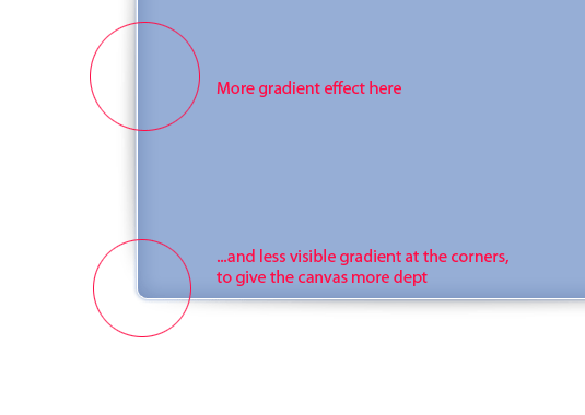
However, this won’t give us enough depth. We want to make this rectangle even more visibly curved, as it does not touch the surface evenly, but adding more shadow using the layer styles, or, making the shadow stronger won’t give us the desired effect. Use this horizontal divider offered by dezinpolio.com and add it to the middles of your shape, so that it will “fade” towards the corners, as shown below:
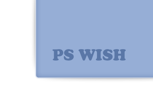
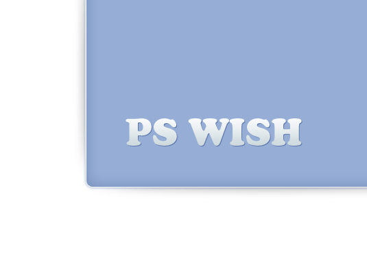
Now, remember we mentioned the bold letters? Web 2.0 makes a good use of fonts, preferable very easy to read, slightly cartoonish and bold. We had a hard time choosing a suitable font and decided to go with “Cooper Std”.
We are doing to add a very mild shadow (#5674a7) and light gradient from white at the top (#ffffff) to light blue (#cdd9de) …
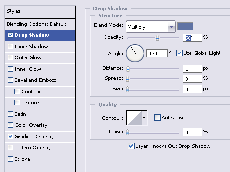
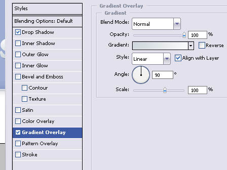
This will give us a very cute baby design.
Web 2.0 is also about a good proportion and while designs are particularly asymmetrical, others are so to speak obsessively symmetrical. I prefer the second type, as it takes less originality and taste to create, all you need is a sense of proportion. Let’s say we add a few buttons at the bottom and side corner of our design…
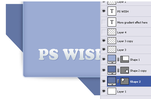
Does this look good?
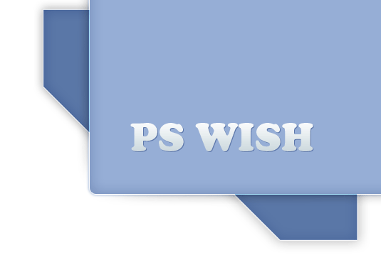
No, it doesn’t because the tabs look way too chaotic, so we will make sure the line of the left side tab,”meets” the line of the bottom tab, like this…
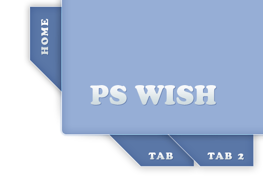
Now it looks proportional.
In case you wonder why we missed a step, the layer styles for tabs are almost identical to the ones we used for the main rectangle and same goes for the font and layer styles of the “tabs”. For learning purposes, you can download the PSD file and analyze the process. Remember that all these semi visible gradient, and 1px outlines is often what makes the difference between great web design and amature attempt in designing. Good luck!
Pages: 1 2


Really good work. I found a lot of profound information which can help me to go on.
Interesting tutorial. My question is: What makes this “Web 2.0”? Web 2.0 has nothing (or little to do) with the look of a site. What you’re talking about here is design, or just the look of a site. That’s it. Flickr.com is a web 2.0 site, and really uses none of these principles. Also, Facebook is very simple, doesn’t use drop-shadows, rounded corners or “slightly cartoonish and bold” fonts, but yet is a web 2.0 site. Also Wikipedia…. etc…
Web 2.0 is about how users interact with the site, and how the site interacts with them.
A nice take on web 2.0 design.
nice tutorial…
I’d like to ask,
how do you know if its a 2.0 design or not?
sorry im just a newbie
Great article, thx 🙂
Also if u looking for some nice free fonts http://www.fonts2u.com
Hi! interesting piece of design 🙂 but the link is not working 🙁 can i get this psd file anywhere else ? thx