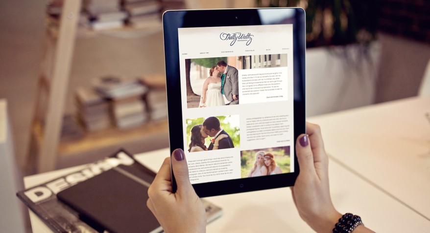
If you are a business owner, it is important to have an elegant website that reflects your brand. You want customers to feel like they belong in your space when they visit your site. When designing a website, there are many things to consider, and this article will cover some of the basics. Specifically, we’ll talk about what colors should be used for different parts of the page, how much text should be on each page, and how to choose fonts that look professional but still reflect who you are as a company!
Research your Brand
Designing your website can be hard, but it is easier if you know what colors and fonts are best for your brand. First, think about how you want people to feel when they visit your site. You might have a color scheme in mind already! Next, consider how your space looks. Do you have lots of leather furniture? Is it modern and white or more traditional with wood paneling on the walls? What do people wear in your office to work every day? All of these things will help you determine what colors would be best for your brand!
Be consistent across all platforms. With so many devices available today, having a responsive website is critical to make sure that no matter where someone is viewing your site, they can easily navigate through it.
Create a Mood Board
You might be inspired by a color or font that you saw on another site, and it’s easy to get carried away with this! A mood board will help keep your brand consistent across all platforms, however, of course, you can use a brand identity agency for that. You can find one online or create one yourself using images cut out from magazines, photos of other sites (with permission!), and anything else you think is relevant for your company.

Creating an elegant website that reflects your brand is not difficult, but it does require some research and time to think about how you want people to feel when they visit. Remember that consistency across all devices will help ensure the best user experience for everyone!
Select a Typeface that matches the Tone of Voice you want to Convey
Your brand should have a tone of voice, and the typeface you choose will help convey this. If your company is very modern and techy, it might be best to use a font that looks similar to what people see on their computer or phone screens! However, if you sell more traditional products like clothing or art pieces from local artists, using a script-style font can give off an elegant feel without looking too stuffy for your business.
Keep Things Simple & Readable
The text on each page needs to be easy to read for customers to stay engaged with your site. You don’t want them to leave after two seconds because they couldn’t figure out where the next button would take them! Using large fonts (at least 14 points) for headings and 12-point fonts for the rest of your text will make it easy to read.
When in doubt, look at what other successful brands are doing! If you find a site that reflects the tone of voice you want for your brand but isn’t quite right, don’t be afraid to take things from there. You can extract colors or elements from their design without copying what they did. Taking inspiration is one thing, but replicating another company’s style completely would not reflect well on yours!
Creating an elegant website that reflects your brand should be easier than ever before with these tips in mind! Now go out there and create something beautiful! A website is the first impression of your brand, and it should be designed with that in mind. We hope this article has given you some tips to consider when designing a new website for your company or business. Read more on how branding services can help your business stand out from the competition here.


