It’s been a long time since I came up with a truly original tutorial and this evening, I finally had the muse to make something that will stand out. I can already see how this tutorial is going to become a classic masterpiece once it gains popularity, so just sit back and read, don’t forget to bookmark this website and subscribe to our feed, to make sure you never miss any of our future tutorials and freebies.
Inspiration: Although today’s horror movies are all quite cheesy, very predictable and always disappointing, I drew my inspiration from one of the infamous and unpopular movies – “Long Distance“, starring the beautiful Monica Keena. Don’t be surprised if it does not ring a bell, I’d be surprised if it did. I myself however love the cover/poster of this movie, the original plot and I decided to make my own little scenery with my own little plot, which is more or less reflected in the film’s poster.

So, let’s get started. The canvas size is really your choice, you may want to make it slightly longer or even bigger because we initially work wit ha small image here.
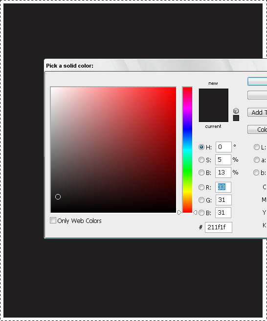
Paint your canvas in a dark color, we used #211f1f.
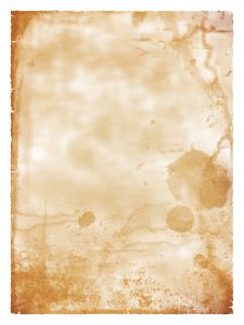
Take one of the grungy backgrounds you like to use, make sure it’s pale enough and not too dark. We used a great image from here.
You don’t need to use stained old paper like I used here. You can also use bricks surface, old wood or any other old-looking texture because this is not going to be your leitmotif, we just need something to be on the background.
Once you have downloaded the texture you want to use, let’s move to the next step.
Paste the background you downloaded unto the dark canvas you are working with. You will need to either resize or de-size it. I didn’t bother downloading the full version of this background, so I just took the small image and stretched it across the canvas because in this case, we don’t mind losing a bit of quality.
Once pasted and resized, set the lending options of the background to “Overlay“. You should have it looking like this..
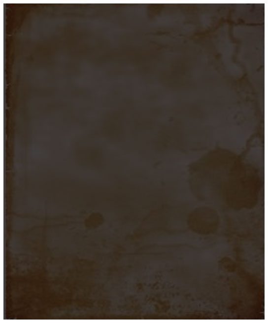
Once this background has been blended, let’s add some more horror-grunge effects. If the hue of your canvas turns out to be different — don’t worry, we will overwrite it all in black and white so the colors are irrelevant at the moment.
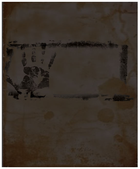
Next, we took this nice fingerprint image, called “Tint black 2”. Again, paste it onto your canvas, resize it, and position it slightly above the middle…
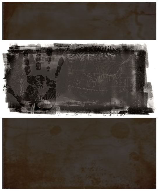
Set the blending options to “Darker Color” and Opacity to 80%.
This is more or less how it should look.
The next thing we need is a model for our main character in the movie. Here I really can’t advise you, feel free to use any photo you really like, if you want — use your own and then print it up as a poster, this could be a great idea for your bedroom! So… Choose a picture of a girl. We wanted to go with a dramatic look so we chose a fantastic photo taken by Zsolt Dreher of a woman in the rain. You can download it here.
Open the file in your Adobe Photoshop. This file was too dark, so we needed to correct shadows, otherwise, in our final (dark) result we won’t be able to see her face.
Go to Image >> Adjustments >> Shadow / Highlight. Apply the following (automatic) settings…
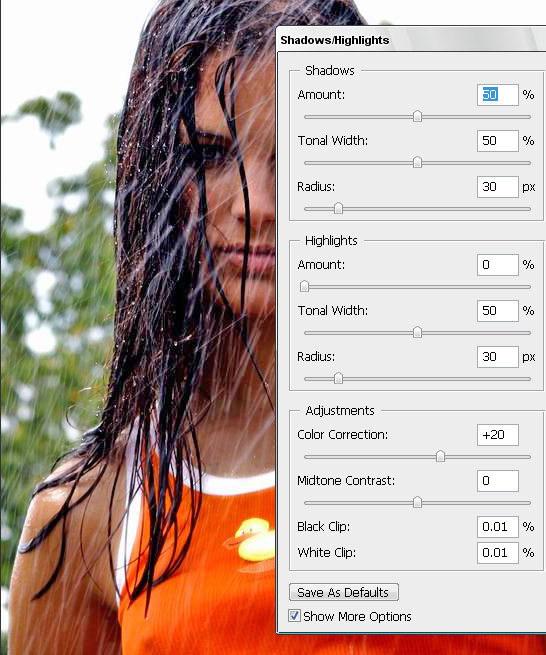
Press OK.
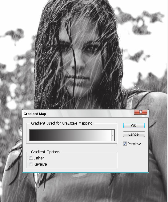
Now, go to Image >> Adjustments >> Gradient Map. Chose gradient between white and black, this should be default. If you are getting a “negative” image (with revered colors), just click the “reverse” box. Thanks to the Shadow/highlight correction we did in the previous step, you will get a classic black and white photo with good contrast.
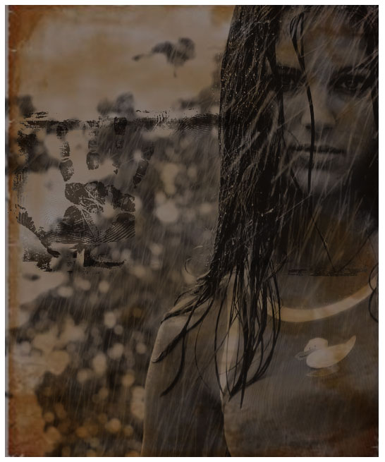
We want it all to blend in nicely, so we place the girl’s photo over all the layers we have so far and set the blending option to “Overlay“.
Don’t worry if you get a messy mix of images because we will fix that too later. Most important is that the main character image (woman, in our case) would be visible and not too dark.
To avoid the previous layer with fingerprints obscuring our character, use the Eraser tool with a soft brush to remove any fingerprints from her face and body.
We want to still add more to our poster design, because it’s a movie poster, it has to have a CONCEPT. And it has to reflect and represent that spooky and mysterious concept. So I looked up a nice and heavy photo of a road, taken by Romanian photographer Pniti Marta, and decided to blend to fold it into our composition.
Take the road’s picture, and place it over the grungy canvas, yet below the woman’s face and fingerprints layers. Set the blending options to “Luminosity,” just like you see on the picture below..
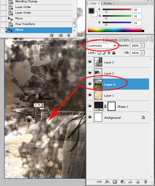
So far, this should be your result. Bear in mind that if you are working with different images and not the ones we used for this Photoshop tutorial, your result may be different, darker or lighter, with better or worst contrast. Try to keep following the tutorial and see if it gets better when we add more layers.
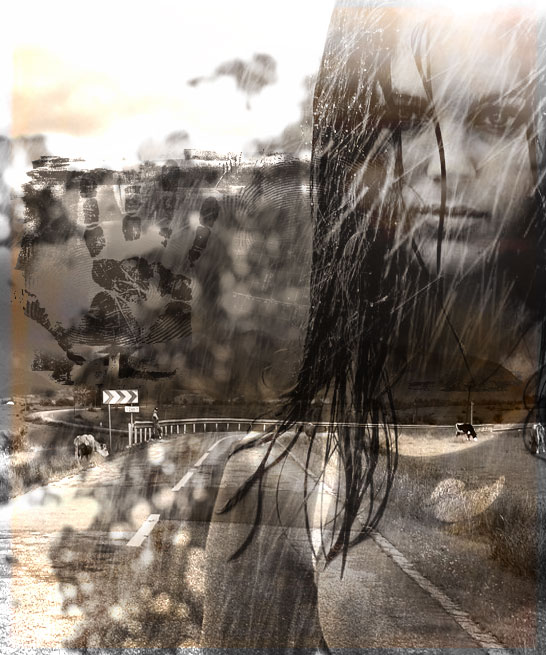
Next, we need a dramatic, classic horror element and I couldn’t think of a better stock photo to use than Silhouette by Cathy Kaplan. I took her image and since once again I didn’t want to wait for the big image to download, I used the small one and stretched it to match the size of the canvas, which also gave me slightly pixelated blurred effect I wanted to achieve.
Paste the small image (or large) on top of your digital canvas, press Ctrl + T, and while holding the SHIFT key pressed, to avoid losing proportion.
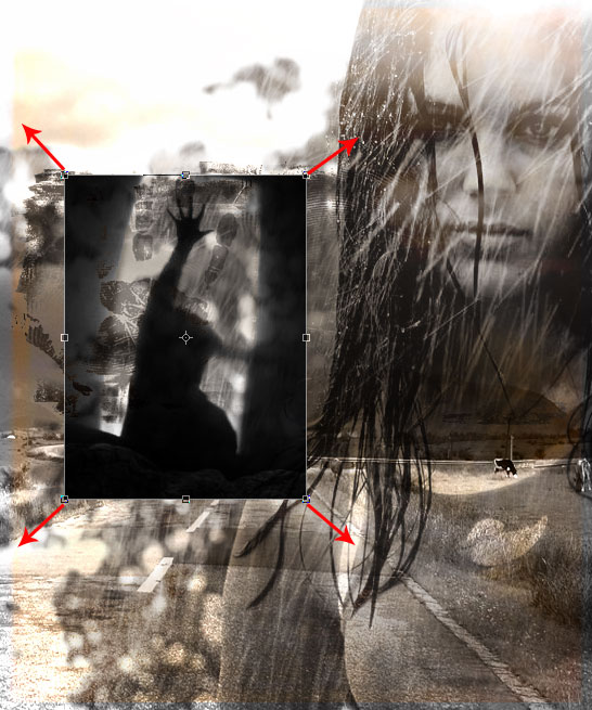
Set Silhouette’s opacity to 80%.
Drag the silhouette layer under the girl and finger prints layer, yet keep it above the road photo layer. The picture below should reflect your results so far. If you lost track with layer sequences and as a result, your poster turns out to be rather different, here is the order of our layers so far, from bottom to top:
Dark (#211f1f) color layer >> Grunge paper >> Road >> Shadow Silhouette >> Finger Prints >> Girl in the Rain
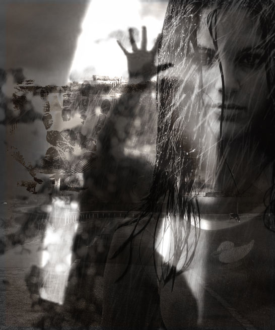
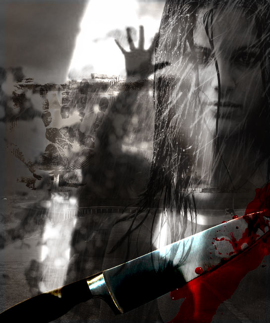
Next, when we have a great black and white background (it turned black and white when we placed a colorless silhouette layer over it), time to add the spicy little details and title. Let’s start with a cliche that any horror movie will have in it, and most of them will have it on the poster as well — knife covered with blood! (yep, we finally got to the chop-chop part!) Choose any weapon you like; we went with a classic kitchen knife I fished out of SXC.hu as well. Crop the white background (in my case I just erased the bg with one click using the Magic Eraser Tool, then Select the remaining part (knife itself, select it by holding the CTRL key and pressing on the layer in your layer palette), then I went to Select >> Modify >> Contract and set it to 1 px. Afterwards, I pressed Shift + CTRL + I to inverse the selection and pressed delete. Voila, the knife is neatly cropped.
Place the knife somewhere at the bottom of the canvas to ensure it does not obscure any of our carefully selected characters.
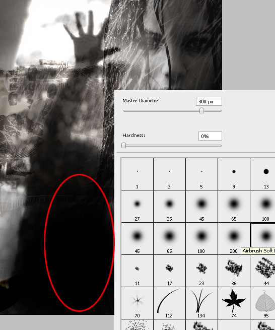
Time to add a spine-chilling title. Since our poster is rather busy, I made a new layer, and using a black color with a soft brush, I added a small black cloud at the bottom, where I plan to place my title.
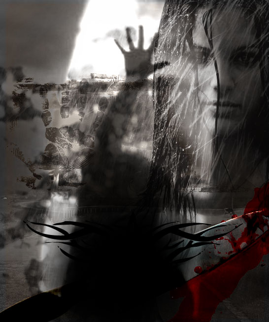
To decorate it a little bit more, I also took one of the shapes I have in my computer and added it on top of the black cloud to give our poster a more of a Gothic look.
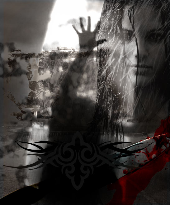
I also took one more shape, of a slightly lighter hue and placed it above the black cloud layer. Now this gives the poster a more of a devilish mood.
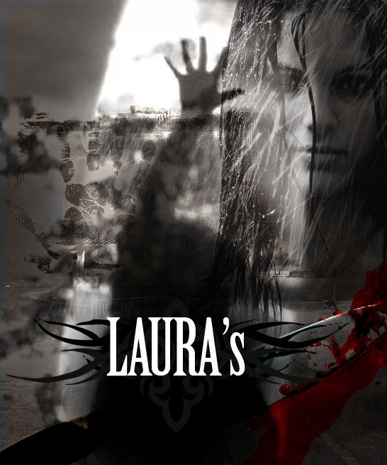
Finally, the most important part – the title. We made use of Birch Std font to write “Laura’s”, in white, 109pt letters; and placed the name over the black stain we previously made at the lower part of the canvas.
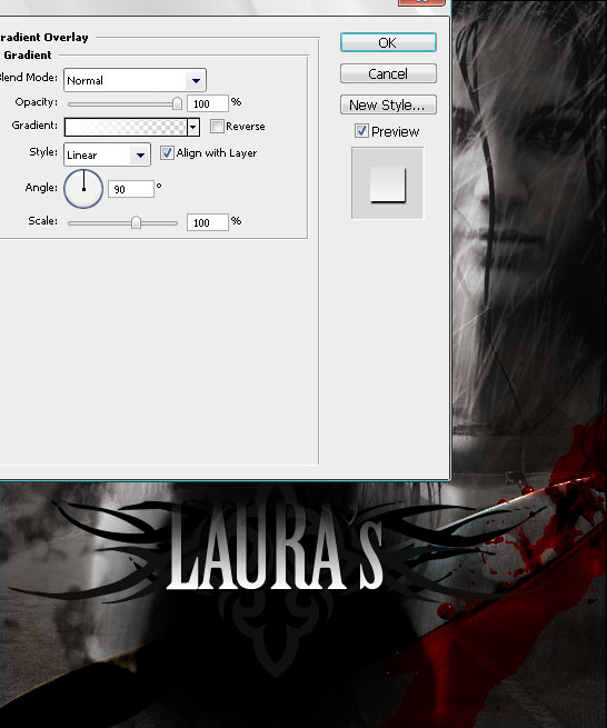
Apply these Gradient settings, by going to Layer >> Layer Style >> Gradient Overlay.. You may also add a shadow like we did, but only if you have a dark overall feel on the canvas, otherwise the shadow will spoil the mysterious look.
The second word in our title is written in handwriting, which is more typical to horror movies and suggests a psychopath actually wrote it himself, with blood. We decided to use an optimistically named font — “Chiller” (costs 29,00 USD to download). Also, just choose a red / scarlet hue of your choice and apply a light gradient, to give the font more depth.
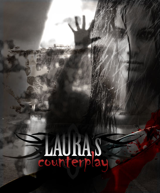
That’s all, really. Hope you enjoyed the tutorial and it will help you to create something beautiful for yourself, your family, or your friends.


The PSD file you download is EXACTLY the same size as the preview image you see, i.e. 546*655 pixels and presents all the layers you see in the tutorial. We do NOT sell or affiliate with photographers whose images have been used. This PSD file is for learning purposes ONLY, if you don’t manage to follow the tutorial, you can download the source file and learn better from it.



Great tutorial, Looks very nice, the part of the picture with the woman’s hand in the air, reminds me of the car scene from titanic!! is that where the image was taken from
You can still see the cow in the backround lol
@ chris, you cracked me from laughter with this comment!
Awesome!!! Thank you so much for sharing this! I just followed the tutorial and got something close to it.
Nice tutorial! Definitely something to try out, good thing you provided the links to the stock photos. Thanks for sharing this tutorial. Keep up the good work!
Great work thanks
Thank you for your comments guys!
What a truly great and meticulous bit of photo retouching . I love the attention to detail. Thanks for sharing!
great job i used this for one of my projects in a computer art class! but i did notice something, on the left eye of the girl there is 2 eyes idk if u might have used the clone stamp tool in there but i just noticed that.
i know that finger print hahaha thanks for sharing this great tutorial man! i really liked it!
Apik2..(awesome)!!
What about this is ‘classic horror’? Looks amateurish at best and, you’d honestly charge someone .99 for this PSD? Are you serious?
Nice blog post. Interesting way to go about creating the effect.
It looks like a good tutoria but assues way to much. Most beginners who want to learn by doing just do not know how to achieve the majority of tasks on here. Other tutorials show step-by-step pictures or explain how to find options as well as what press, but this one seem to go from A to G in the same “step”.
Maybe once I know more this will come in handy, but for now, it’s too frustrating having to refer to other sites to find out how to perform each so-called “step” (more like a long jump!).
If you’re a n00b, stay away from this one.
keep educating us with these tutorials buy spotify plays and
buy telegram members
Would or not it’s pleasant to understand how many activities they each joined and the way generally they
did not money?