Important tip: pick only colors that already present in your photo / image, this is how we came up with this palette for our frame:
#42514a – Dark green-blue – this shade was chaotically picked from the darker side of the ocean background.
#979856 – Dirty beige – this is the hue of our water in front of the girl.
#c14c20 – dark-dirty orange – this color, as unbelievably as it sounds, was picked from girl’s body, as you can see, she is actually of a dirty orange color.
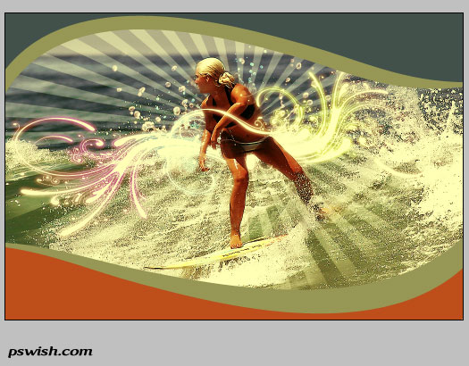
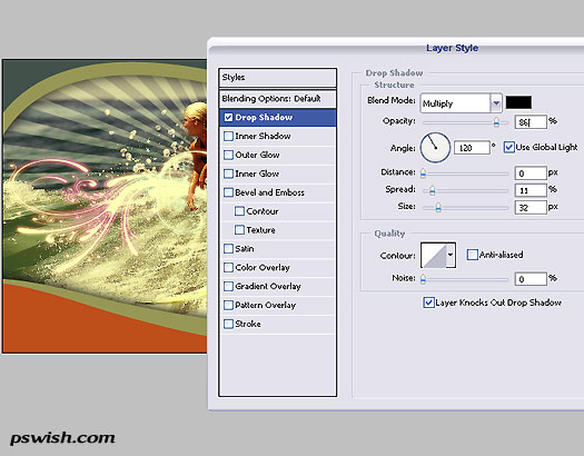
After you have completed painting the curves (We will not teach using the pen tool here as we are arrogant and assume it’s a very basic technique you should know), add a shadow to the INNER, beige lines, so that the shadow will stand between the photo and the colorful frame, giving the composition more depth. See below the drop shadow settings:
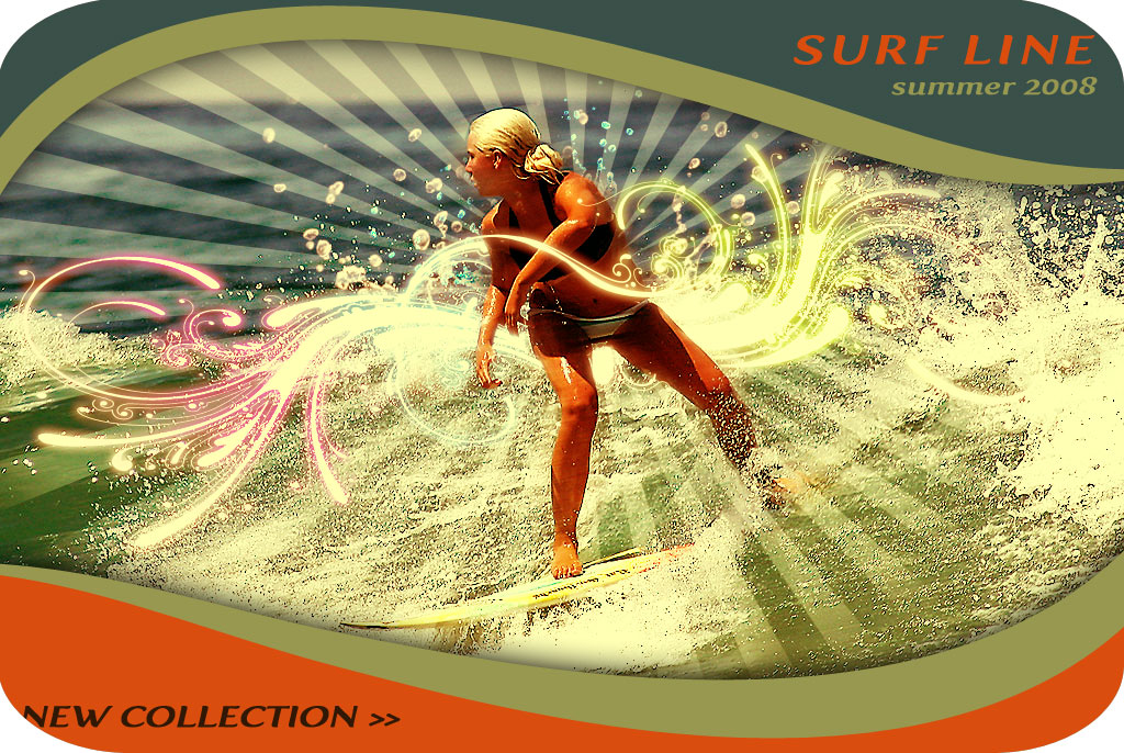
So, we have it ready! Just add text (in same colors as the frame!) and crop the corners, if you want to have a more tag-like look of a label, and you are done.
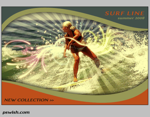
Click to full view:




This is incredible. Thanks
I am really loving those tones used in the border, it caught my instantly
I found your site with stumbleupon and this Tut is very usefull and clear, I´ll back again…sure.
That is an awesome work bro… !
Really nice tutorial, will have to give it a try.
fantastic
I loved it. Thanks!
shape tool,“Registration target 2? download link
I think the are to much elements in the picture.
please…custom shape tool,Registration target 2? download link
I loved it. Thanks you
Nice one, tnx! *hang-loose* 😉
Hi, my daughters would like to create a surf label brand, and we would like to know how would get a start with our ideas please? We saw the young teenager on the television and know it is possible. My girls are very art orientated and have ideas to share with the world. We would like know how to be successful in this industry! Do we first have put together a portfoio on own ideas them have them secured and get a factory to make them or a sponsor ? We really would like to get a head start on this one please! Is there a website that can show us the way to the top?
Thanks for listening, we will still continue to search for answers Thanks Donna Bennett
great tutorial!Thanks
very nice tutorial – different than the usual fare and well explained – thanks a bunch!
Hey bro, wanna chill? The design elements dont seem to match, unless you really did intend for such a sharp contrast. Maybe you should tone down on the spirals.
this is very super
I dont understand what the “blurred” layer/duplicate photo does or adds to the image…can you explain more?
i think they should have printable versions of these tuts lol
This is great i definately need to try this one.