

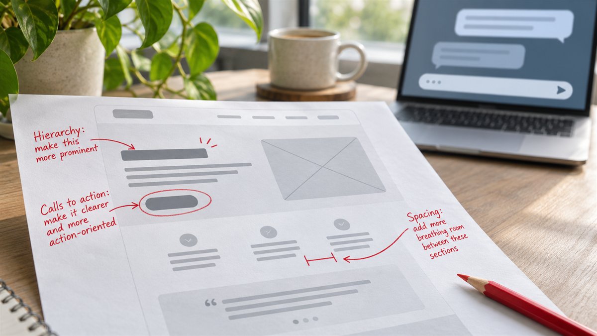
“What do you think of this design?” tends to invite general praise or taste judgments. A useful critique starts with the page’s job. A landing page for appointment requests should make the service and next step clear; a download page may need to explain what the file contains and what information the form asks for. The same visual choice can work on one page and get in the way on another.
Prepare the evidence before prompting
- Audience and task: who arrives, what they need to decide, and the intended action.
- Actual copy: headline, supporting text, button labels, form fields, and any proof shown.
- Page views: desktop and narrow-screen screenshots, or a non-sensitive page URL if the tool can access it.
- Constraints: brand rules, required content, and what cannot change.
Remove confidential client details before sharing them with a third-party AI service unless their use is authorized. If you provide only a screenshot, the model cannot test the live form, keyboard navigation, or actual CSS values. State those limits in the prompt.
Ask for an evidence-based critique
Review this landing page for a visitor who needs to [task]. The page’s primary action is [action]. Use the supplied copy and screenshots. Identify up to five issues, ordered by the likely effect on understanding or completing the action. For each, quote or name the exact page element, explain the problem, and propose one change. Distinguish what is visible from what requires a live-page test. Do not invent conversion data, user research, or an accessibility pass.
The model’s answer should be easy to falsify. “The page lacks hierarchy” is weak. “The hero has three same-weight buttons before the service is named” points to something an editor can inspect. If a criticism cannot be tied to a visible element or a stated goal, ask for evidence or discard it.
Turn criticism into a small testable edit
Consider an illustrative landing page with the heading “Beautiful solutions for your business” and a button labeled “Learn more.” If the page offers repair appointments, the critique could identify that the heading does not name the service and the button does not describe the next step. A revision such as “Book a repair appointment” for the button makes its destination clearer. The exact headline still depends on the real offer and business.
Change one high-impact element, then inspect the page again at both widths. Do not accept every suggestion at once: a longer headline may clarify the offer but wrap badly on a phone; a larger button may crowd the hero. The design is judged in context, not in the chat response.
Check what ChatGPT cannot establish
| Question | How to check it |
|---|---|
| Does the primary action work? | Follow the link or submit a test form on the live page. |
| Is text readable over the background? | Measure the actual foreground and background colors against the relevant WCAG contrast criterion. |
| Can keyboard users reach and see controls? | Navigate the rendered page with a keyboard and inspect focus states. |
| Does the mobile layout hold together? | Review the real page at a narrow width with final copy and images. |
| Is a proof claim true? | Check the source for the testimonial, statistic, or result before keeping it. |
The WCAG 2.2 contrast criterion gives measurable thresholds; an AI impression of a screenshot does not. OpenAI also warns that ChatGPT can be wrong. Use its critique to find questions worth testing, then make the design decision from the page and its evidence.
