

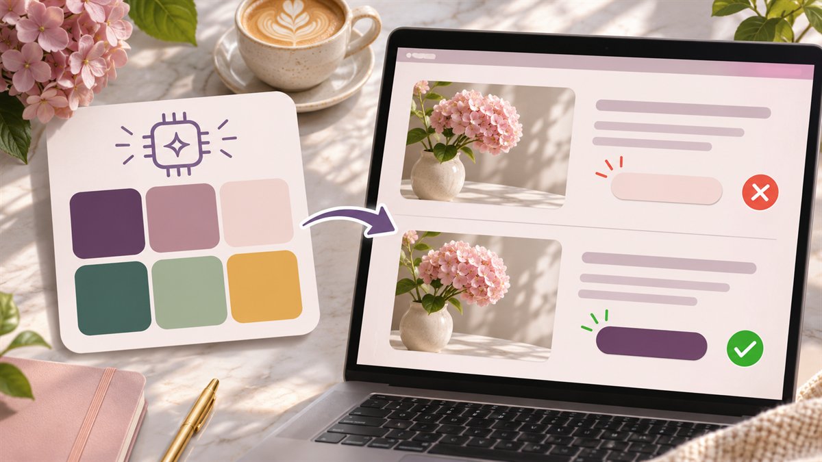
Five attractive swatches can look convincing in a mockup. They tell you little about the real page. A site needs color choices for long paragraphs, links within paragraphs, buttons, form errors, borders, and focus indicators. A generator that supplies only “primary,” “secondary,” and “accent” leaves those decisions unresolved.
Turn the swatches into roles
Start with a small specimen page: a heading, body paragraph with a link, primary and secondary buttons, form field, success message, and error message. Put the candidate colors on those elements. This exposes conflicts that a row of circles hides.
| Role | Question to answer | Common failure |
|---|---|---|
| Body text and surface | Is a long paragraph comfortable to read on its actual background? | A soft gray or pastel looks elegant as a swatch but leaves text faint. |
| Inline link | Can readers identify it within a paragraph, including without relying on hue alone? | The accent color blends into body text or is the only link cue. |
| Primary action | Are the button label and the control itself clear in normal, hover, and focus states? | One color is assigned to every state, or the label loses contrast. |
| Status message | Is the meaning written out as well as shown by color? | A red border is the only indication of an error. |
The roles should remain stable across pages. If the same teal means “link” in one section and “success” in another, the palette may be visually consistent while the interface is confusing.
Measure the combinations that appear on the page
WCAG 2.2 sets a minimum contrast ratio of 4.5:1 for normal text and 3:1 for large text at Level AA. Essential visual information in interface components and graphics generally needs 3:1 against adjacent colors. See the W3C guidance for text contrast and non-text contrast. A palette has no single accessibility score: test each pair in its actual use.
Check text on solid surfaces, text over photos or gradients, button labels, input borders, and focus indicators. If a background changes behind a heading, measure the least favorable area. A contrast checker needs the real foreground and background values; asking an AI model whether a screenshot “looks accessible” is not a measurement.
Color must also avoid carrying meaning alone. An error should have a message or icon with an accessible name, not only a red outline. The W3C use-of-color guidance covers this distinction.
A better prompt for generating candidates
Ask the model for roles and constraints, then check every proposed value yourself. This example is a planning prompt, not a tested palette:
Suggest a compact color system for a content-heavy website. Give hexadecimal candidates for page background, surface, body text, heading, inline link, primary button background and label, border, focus indicator, success, and error. Explain which colors are paired. Do not claim WCAG compliance or invent contrast ratios. Avoid using color as the only status cue. I will measure the combinations on the actual page.
If the model returns a cheerful palette but no readable text color, ask for a revision of that role. If it gives precise contrast numbers, calculate them independently. A tool such as ChatGPT can help enumerate roles; a visual editor such as Canva can show a mockup. Neither replaces checking the implemented page.
When to keep or discard the palette
Keep a candidate when its colors work across the main page roles, its accents have a clear purpose, and the remaining changes are small. Discard it when readable text requires changing most of the swatches, when controls depend on subtle color differences, or when the palette fights the brand’s established colors. The final output should be a set of named design tokens and tested pairings, not just a mood board.
