There are so many tutorials and guides online that teach you how to make effective use of the web 2.0 design. While most these tutorials are useful, at the same time they kill the originality in web design. For example, most “guides” tell you that web 2.0 is about having a glossy badge, stripes background, and bold fonts. Result? There are countless hundreds of designs with badges, stripes and bold big letters… and they are no different from one another. It does not matter if you make a web 2.0, web 1.0, or web 75.0 design, it all comes down to being original and memorable.
However, if can’t really find anything particularly original to symbolize your design, it’s “safer” to go with the current trends of web design. So here is a very small fragment of web design layout, and how to turn a regular layout into a web 2.0 layout.
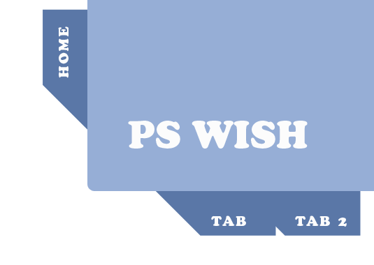
This is what we had…

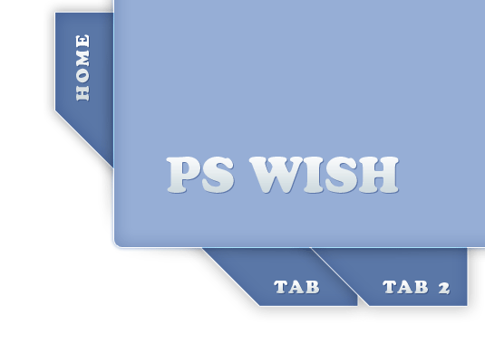
And this is what we are going to do…

We are going to work in Photoshop, using nothing but layer styles; focusing on mild gradients and shadows.
Start off by using the Rectangular shape with rounded corners, and drawing a… rectangle.

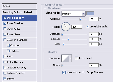
What we need to do first is give our rectangle some depth and life. Following the principles of web 2.0 design, only shadows, outlining and light gradients will give us this effect. So go to layer styles, and drop a little mild shadow. We used #96aed6 for this purpose.

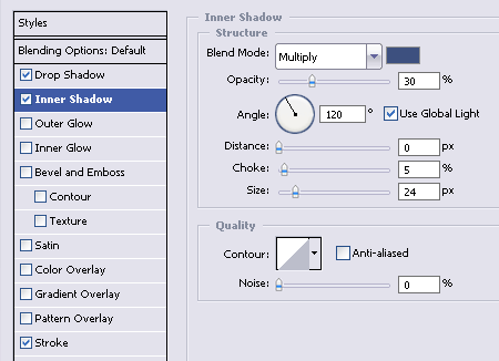
To give the shape a little depth (so it won’t look like a flat object), add mild inner shadow, with darker tone (we used #304f82 )

Lastly, its important to add a little outlining. We will use the #FFFFFF white color, since our shadows from both sides are darker, we want to have a light and semi visible line that will contour the shape.


[…] Marie wrote an interesting post today onHere’s a quick excerptThere are so many tutorials and guides online that teach you how to make effective use of the web 2.0 design. While most these tutorials are useful, at the same time they kill the originality in web design. For example, most “guide” … […]
[…] Jacob Cass wrote an interesting post today onHere’s a quick excerptThere are so many tutorials and guides online that teach you how to make effective use of the web 2.0 design. While most these tutorials are useful, at the same time they kill the originality in web design. For example, most “guide” … […]
Really good work. I found a lot of profound information which can help me to go on.
Interesting tutorial. My question is: What makes this “Web 2.0”? Web 2.0 has nothing (or little to do) with the look of a site. What you’re talking about here is design, or just the look of a site. That’s it. Flickr.com is a web 2.0 site, and really uses none of these principles. Also, Facebook is very simple, doesn’t use drop-shadows, rounded corners or “slightly cartoonish and bold” fonts, but yet is a web 2.0 site. Also Wikipedia…. etc…
Web 2.0 is about how users interact with the site, and how the site interacts with them.
A nice take on web 2.0 design.
nice tutorial…
I’d like to ask,
how do you know if its a 2.0 design or not?
sorry im just a newbie
[…] De mensen van pswish.com hadden het al even door, maar ze maken het nu officieel: Web 2.0 is een gevaar voor de identiteit van websites. Origineel Artikel […]
[…] View Tutorial […]
Great article, thx 🙂
Also if u looking for some nice free fonts http://www.fonts2u.com
Hi! interesting piece of design 🙂 but the link is not working 🙁 can i get this psd file anywhere else ? thx