Typography on a web page is as important as it is in any other medium, it does not matter whether you are typing for packaging, publishing television or signage, and all designers must take into account the medium they are using and the techniques they will use to suit that medium. You want your work to be easily read and be pleasing to the eye.
This being said an example is that of an article written in a magazine compared to that of a poster. While a magazine is read at close distance and within arms length, the typeset can be small and still be easily read. Whereas a poster is larger and seen in a more oblique manner, you would want to space the words so they are easily discerned by the viewer.
When designing for a webpage there is a full set of new problems to overcome. You are dealing with an audience that has different screen sizes and platforms. There is a way a designer must work to take all of this into consideration while designing a page that it easily viewed in all different platforms. You can not assume that all of your viewers are using the same equipment you are; even the speed of connection should come into mind when you are designing.
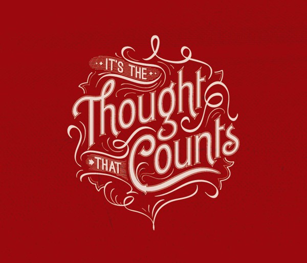
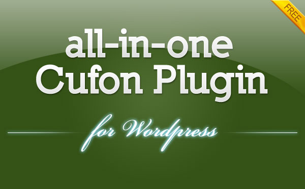
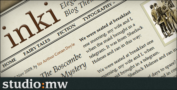
Examples of Good Use of Typography in WordPress:
Depending upon your content you can change up the style sheets to best suit your needs. You can change heading and sub heading sizes as well as your body text sizes to best fit your page whether it is an informational site, children site or a more technical site. These type settings are simple to change and the style of your webpage should take into consideration your targeted audience. You would not use the same style on a children’s page as you would on a page created for business investors so it is important to keep your targeted audience in mind.
- Orientation – If you are reading a book and you see upside down type the first thing you do is flip the book, not such an easy task with a computer. Vertical type is not possible with HTML but it can be done by using a JPG, PNG or GIF. This can work for you if used sparingly. A heading of this type will grab the reader’s attention and if in a good balance with her things like color, weight and size can be beneficial. This type of heading calls for attention and when used alongside other material can unify this material and become very effective.
- Position – As a different type style used such as maverick, any line that is in a different position will quickly catch the eye of the viewer. Breaking up the natural flow of the page will simply get more attention. You can change any body of text by only changing one element such as font, color position and so on. Anything that looks different or out of place will automatically draw the eye to it. Just like the saying goes, rules are sometimes made to be broken.
- Space – If you type on a white page one word of 8 point type, your eye will be drawn to it. On the other hand if you’re working with a full page of 12 point type you will never notice it. So as you can see not just the type on the page is important, the space that is surrounding the type is just as important. You can easily learn this skill by playing with different type and space settings to get the most out of the idea you want to put across. This is not only a technique used in writing, it is used is painting, architecture and more.
- Priorities used in a creative manner – Typography means that you will also think about the importance of information and what you want the viewer to focus on, you can do this by easily deciding what is important and getting that important information to stand out. You can create a web page that is pleasing to the eye while still getting across what is most important. You will find it very rewarding when you take this important fact into consideration. You want the important content to stand out so the viewer can see exactly what point you are trying to make without having to read through pages of fluff.
Here are some tips for the use of different fonts in HTML:
- Use the correct font style and case size to get your information processed quickly by the viewer. If your viewer is seeking information you will want the font to be something simple to read such as Arial or Veranda so they can easily read through and find what they are looking for. You should also keep in mind the color and size of the text.
- When you are looking at your web page design always keep in mind the type, color and size of font, this is very important this can instantly add more value to your web page.
- Choose a font that is simple to read. Using a font such as Times new Roman keeps everything in uniform, a font such as calligraphy is very distracting and too hard to read. The best thing for you to do is read through a few lines and determine if you can read it easily. If you can do it your viewer can too.
- Do not fill you page with different font styles, if it is called for such as an artistic site, you may use different font styles but they should be used in the headings or sparingly throughout the text, do not fill your text with different fonts because it becomes distracting to the viewer and they will lose interest.
- Most of your text should be between 12 and 14 points. This allows all readers the easy access because not all readers have perfect vision a small print may deter some viewers from your site and you do not want to loose viewers, the point is to make a site attractive to all. You should keep in mind that you will have many viewers and you should try to compromise for all viewers, and make sure your heading is in a larger font than the text.
- The final tip deals with color, use a good contrasting color for type that will not be lost in background colors, the best choice is always black type on a light background, just be careful when choosing colors for your web pages, you do not want to put a dark background and dark type on the same background, it will be too hard to read and your viewer will be lost.


Hi,
You cited good points. Good job!
Jojo Siao
[…] Typography on WordPress Blogs – What You Need to Know […]
[…] Typography on WordPress Blogs – What You Need to Know […]
Very very nice and useful…thank you!
[…] Typography on WordPress Blogs – What You Need to Know […]
[…] Typography on WordPress Blogs – What You Need to Know When designing for a webpage there is a full set of new problems to overcome. You are dealing with an audience that has different screen sizes and platforms. There is a way a designer must work to take all of this into consideration while designing a page that it easily viewed in all different platforms. You can not assume that all of your viewers are using the same equipment you are; even the speed of connection should come into mind when you are designing. Typography on WordPress Blogs – What You Need to Know » […]
[…] Typography on WordPress Blogs – What You Need to Know […]
Good points, I’ve seen some awful examples of typography in blogs, I just click away regardless of how much I was looking forward to the content.
[…] Typography on WordPress Blogs – What You Need to Know […]