Every website will have different design and features, but they do have certain things in common. Regardless of the direction you want to go when taking your business online, there are a few elements you must include.
These common elements are the things your online users expect when it comes to using a site with ease. Let’s talk about some them that you should prioritize. Remember, the devil is in the details.
Plenty of space.
Space is a vital tool since it dictates readability and flow. More sites today feature vast spaces, increased spacing between lines of text as well as an overall use of open space. Key spatial relationships include spacing consistency, similar spacing both lines and paragraphs. Space is also important when creating a focal point for users. Elements surrounded by white space get highlighted.
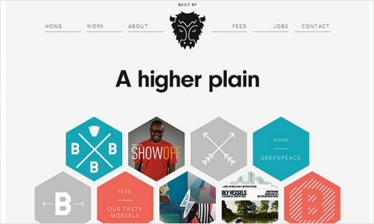
Start with navigation menus, for instance, and make sure that elements are organized and include spacing between elements.
Straightforward navigation.
A simple and effortless navigation is always the way to go. It should be easy to see and use. You need to keep them to a minimum so you don’t overwhelm users. Depending on the site type, five to ten menu navigation items should be your aim.
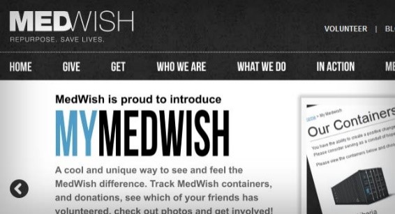
The easier it is for users to navigate through the site, the longer they are likely to interact with it, which leads to more conversions. Use a simple navigation for your website’s framework. Users want to know where they are, how to go back, and easily get directions.
A Captivating About Us.
It is crucial for businesses small or large to tell users who they are. Of course, it’s less important for major companies that are household names, but it’s still a common practice. Your About Us page obviously tells your users who you are and what you do. It can also be a place where customers can add testimonials, reviews, and success stories.
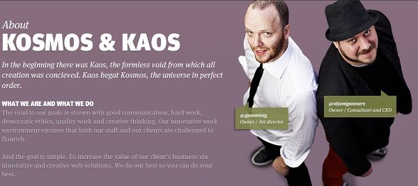
You can also use this page to link to your social media channels. Keep this page simple and add just enough information to get your users interested. And keep the design interesting. Put a little personality. Try adding photos of your team with a short company biography.
An Effective Contact Us Page.
Your websites contact information usually appears in the header or as contact us page with form or extended information. Any of these two work well, subject on your site design. The key is making it highly visible. Adding information such as your physical address, a form of contact, and phone number add legitimacy to your business and site.
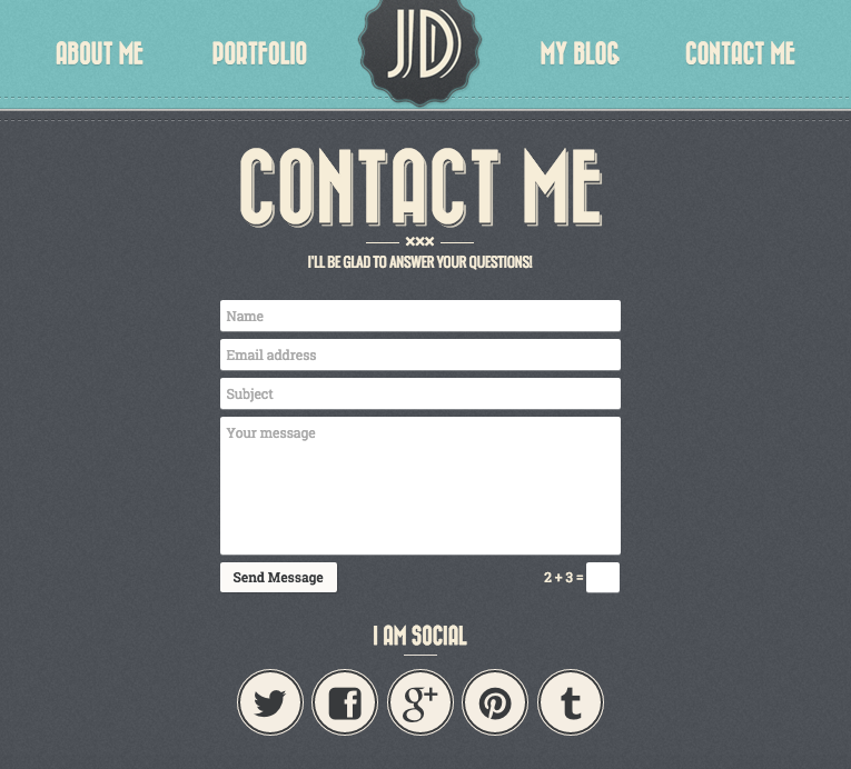
Add contact information to all static headers as well as footers. Include your physical business address if available. You may also add a contact form so users can send a message directly from the website.
The bottom line
Now that you know the features – elements your website needs to succeed, it’s time to take your business online. If you already have a domain name in mind, check out Crazy Domains NZ to have it registered as soon as possible. Take note that the more domains you register or hold under management, the cheaper your domains will be for new registration and renewals.
While there’s a lot of crucial factors to effective website design, these key features can make the difference. Always include and focus on them to make a website that’s oozing with appeal and potential.
