The word ‘speed’ will dominate in 2021. This has everything to do with the 5G revolution. The revolution has officially begun, which will spill over into how we design our websites and mobile apps for users. That’s why this year’s UI and UX focus is on creating a great user experience through speed, minimalist design, and authenticity.
How can we go even faster?
5G is the fifth generation of cellular network technology and is slowly taking over the world. All iPhone releases are expected to support 5G from 2021. 5G is expected to be 100 times faster than our current 4G network. 5G offers better download speeds and shorter latency. The latency is how fast the network responds to a request, such as requesting a page or an image. As a result, you have fewer network delays that can ruin the response. You see almost immediate results after an action.
Because the speed of data transfer and latency time will improve significantly, the page’s slowness or slowness of functionality on a page is no longer accepted by the user.

So everything revolves around the user’s experience.
In this blog post we will show you many examples, so that you’ll be able to understand the UX we are talking about.
For example, when we talk about user experience, visit websites that have UX polished to perfection, such as the Bet in Ireland Casino™ site. This might not be your typical Web 2.0 candy theme, but the website scores 99% speed on Google Speed test, making it absolutely perfect for user experience. It loads instantly.
That is why we will see the loader less in 2021, and it will become irrelevant in a few years. Some calls-to-actions take a little longer to process information, such as an order confirmation or transferring money. That is why it is advisable to use a loader for this.
But how can we respond to this?
How can you contribute to a good user experience?
- Critical CSS
One way to increase the speed is to use critical CSS. A small CSS piece with styling for elements directly on the screen is put inline in the head (or in a small CSS file that is first loaded). As a result, the first meaningful spot in which content can be seen on the page is loaded earlier than the browser has to wait until all CSS or all javascript is fully loaded.
- PWA
What can also no longer be ignored in 2021 is PWA. Progressive Web Apps is about the user reaching his final goal as quickly and easily as possible. With PWA, the loading times are shorter so that the user does not have to wait for the page to load. The user does not feel that they are using a website but rather a native app.
With PWA, you can add a shortcut to your home screen, get push notifications. Still, there is also increasingly better support for accessing your phones’ hardware, such as a camera or GPS. Instead of the network-first approach, the cache-first approach largely solves the ‘slow network ‘ problem, making the user experience better and better.
- Uninterrupted UX
How the buying process works now:
- You click on the page you need.
- To view all photos, click on ‘more images.’
- For reviews, click on ‘all reviews,’ a pop-up will open, another page will open, or you will be navigated down.
- When you finally want to buy the product, click on the shopping cart button.
- You click on the shopping cart and go to the shopping cart page.
- Undergoes checkout.
- Fills in all text boxes.
- Agree to the terms and conditions.
- You choose a payment method and execute it.
- You will receive an invoice by email and track your order.
How the buying process should ideally be
Because of every step that you have to undergo now, and because of the wait, you will increasingly doubt your future purchase. The chance that you will drop out or become distracted is increasing. You want to have a fast and clear flow—a goal without waiting and without distraction.
For example Bike Configuration by Den Klenkov. He shows a way of how the configuration of a product and the purchasing process merge smoothly without getting distracted. In 2021 it is not only about page speed but also about a clear fast flow.
What does such a new workflow look like?
A clear, fast workflow is good for the user experience and is one of the most important web and app design elements. Can users perform their tasks with ease? Or do they run into annoying detours or difficult steps? In an uninterrupted workflow, you must ensure that the user can remember the steps they have to undergo.
Reduce the load on the short-term memory by adding only the required number of steps and disturbing the user in their natural flow as little as possible. In addition to the necessary steps, it is also important that an app or website’s response time is good. Of course, the experience stands or falls with the reaction mentioned above speed when navigating through these steps.
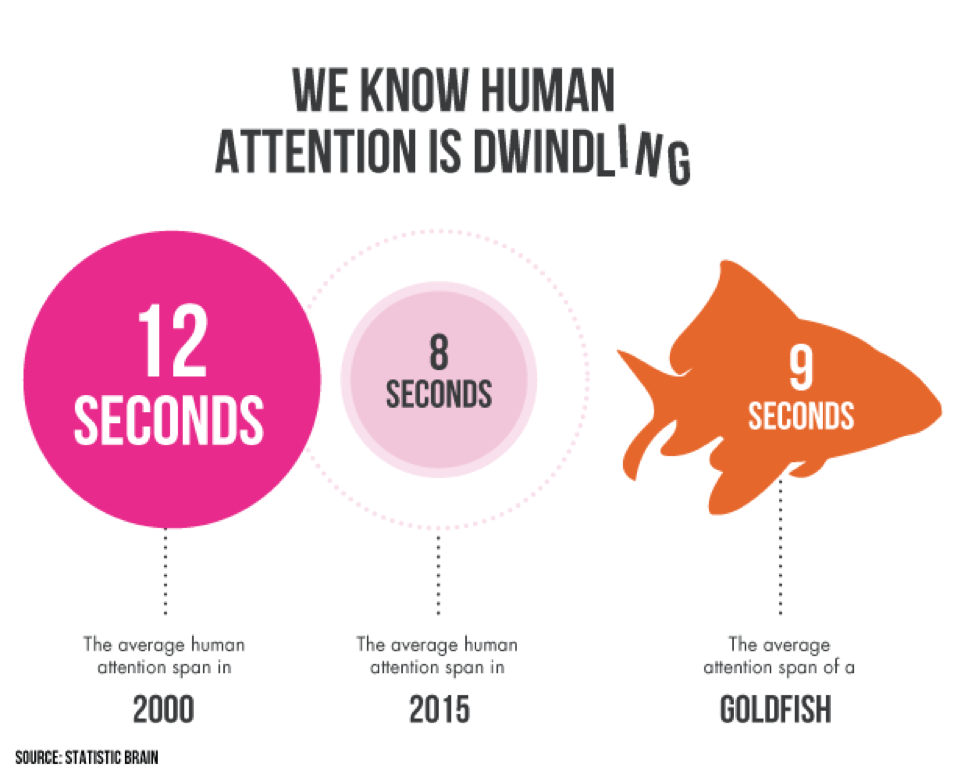
It is even said by some sources that today we have a shorter attention span than a goldfish. But how do we, as UX / UI designers, deal with this?
Hi there, are you still reading? Did a WhatsApp message get in between? Were you thirsty and went for a cup of coffee or tea? Or are you distracted by something completely different?
If this is not the case and you are still reading, give yourself a pat on the back. You’re one of the few. It is even said by some sources that today we have a worse attention span than a goldfish. But how do we deal with this as UI / UX designers?
Minimalist design is a good basis for a better user experience.
In this case, the main question is, ‘how can you keep the user’s attention?’. A logical answer would be to not or less distract a user: no more illogical flow, no navigation to other pages, and no unwanted pop-ups. A carefully curated design that is simple and clean should be the foundation of your design. You could apply these next four steps.
- Whitespace ensures a better user experience.
We often feel that silence, emptiness, and colorlessness are bad. We fill in the silence to talk about little ones. We fill in the colorlessness with color. We fill in the gaps by putting everything close together. But do you know that silence, emptiness, or colorlessness is good for us? Especially in web and app design.
Websites and apps often use multiple key elements on a single page that compete for attention. If these elements are too close together, the effect will be even greater. Using whitespace in the right way gives the elements the right amount of emphasis. Applying this will provide a good user experience and allow the user to sink the message or action.
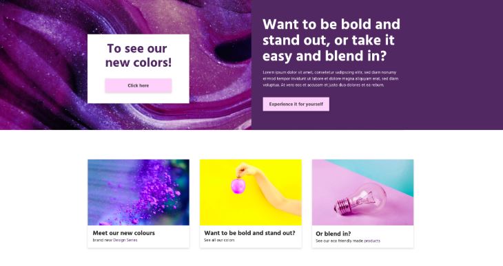
Example 1: elements are competing for attention.
Because two elements that both compete for attention are next to each other, you are not sure what to do (see example 1). An action is requested for both elements.
To give the elements more power, you could position them differently (see example 2). Due to the white spaces and because one of the elements has been given a different position, there is no longer any competition for attention. The white spaces also have a pragmatic aspect. Our brain needs time to process information. The use of white spaces gives you more options for this. The visitor is less likely to be distracted by other elements.
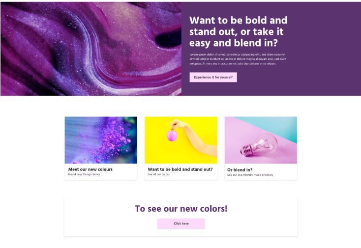
Example 2: elements that do not compete for attention.
- Apply Gestalt Principle for a better user experience
In the early 1900s, a group of German psychologists developed various theories about how people perceive the world: The Gestalt Principles. Our brains tend to organize everything we see into groups or patterns (coherent shapes) in order to create structure. But what does this have to do with user experience?
When you apply the Gestalt principles in the UI / UX, you take into account the users’ cognitive capabilities. This ensures that users get a better overview and that they can make a choice more easily. I would like to explain one of these principles.
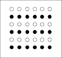
Principle of Similarity. We automatically see objects that look alike as a whole. What exactly is the same does not matter. This could be the shape or color, for example. If buttons or links have the same color and shape, they automatically assume that their functions are similar. Therefore, using one style is important and ensures peace of mind on the page and for the user. This ensures a better user experience.
- Less text
Do you know that feeling that you have to write everything down so that everyone understands what is going on in your head, what the company stands for, or what you can do with the products you sell? I’ll tell you something: hardly anyone reads long texts.
Did you know that the user usually determines in the first 10 seconds whether they stay on your page and therefore read the texts? Maybe the users don’t even read your texts. They scan them. That is why it is important to make the text easy to scan.
- Headers and visuals
By making smart use of headers and visuals, it is clear at a glance what the page’s purpose is. Everything is becoming more and more visual, and Google is taking this into account for the search results. You even improve a website’s SEO if you use relevant visuals (such as images, infographics, and videos: see Eric Newton‘s blog ). Using a clear visual hierarchy makes the content easy to understand and scannable for the user.
For a better user experience, do not write web texts by word count for better SEO. The more value you add to the texts, the better your position in Google will be. If the user goes back to Google within seconds because your text does not provide a value, dwell time will lower your Google rank. Dwell time is the time a visitor stays on your website before returning to the search results.
It is expected that after the Olympic Games in Tokyo, fewer and fewer illustrations and graphic design will be picked from the web. Still, companies will have them made to measure.
Authenticity is the main focus in 2021
We can get all our information, photos, and illustrations from the internet for free or for a small price. This makes it easy to fill your website, and this also happens regularly. In 2021 this will change, and the trend will start to show real people, make unique illustrations, and incorporate an active voice in texts. Fortunately, some of this trend is already underway. More and more companies are hiring a photographer to take pictures of their employees.

After the Olympic Games in Tokyo, fewer and fewer illustrations and graphic designs are expected to be picked from the web. Still, companies will have them made to measure. Why after the Tokyo Olympics? When you think of Japan, you think of illustrations, manga, anime, and other graphic visuals. It is expected that full use will be made of this art form at the Olympic Games. Hence, this may become the founder of the authenticity trend.
How can you speak one-on-one with the readers?
Not only photos, illustrations, and other graphics are revised by this trend, but also the textual part. We often write in an instructive way to provide our users with information. As a result, a text sometimes comes across as impersonal. To attract the attention of users, it is better to use an active voice. This is a way to speak directly, one-on-one, with the readers. With an active voice, the subject of the sentence performs the action. This sounds clearer and more attractive than a passive voice.
Passive & active voice
‘We will give a lecture about UX and UI.’ Sounds more attractive than ‘the lecture about UX and UI is provided by us.’ Try to avoid words like “by.” These may suggest that you are writing with a passive voice.
- Passive voice: after reporting a malfunction, you will receive a response from us within an hour.
- Active voice: malfunction reported? We will respond within an hour.
- Passive voice: do you want more information? By clicking here, you will get in touch with us.
- Active voice: More information? Please contact us.
By using an active voice, readers not only feel personally addressed, but they can also better scan your texts for the information they need.
Good texts and good visuals are important for the authenticity of your company and brand. Show and hear who you are by using unique and personalized content. This way, a user can empathize with the information you want to convey to them.
Make sure you have a good user experience: focus on speed, minimalist design, and authenticity.


