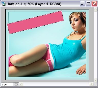
Using the marquee tool, draw a box, not very big one, this is where your website’s name will appear.
Fill the Box with #e85c88 colour.
Press Ctrl + T to Free Transform the box, and rotate it in about 20-30 degrees as shown on the picure…
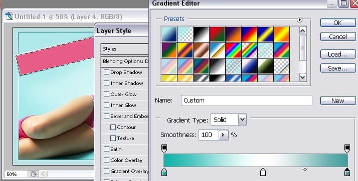
Go to Layer >> Layer Styles >> Blending Options and apply this gradient stroke effect to the pink box (same as we used for main template body).
Use the colours: #4fa5a4 … #ffffff … #4fa5a4
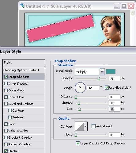
And also a shadow, of the same hue, #4fa5a4
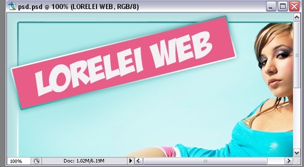
Select the typing tool and add text to your pink box. Since the layout is rather funky, use some funky font as well, any graffiti like font will work here good, we used “BadaBoom BB”, available free at dafont.com
Remember how you just make the pink box for the header? Good, make 4 more, only smaller… or duplicate the existing big one and re-size it to a smaller size.
If you are making them anew, do not forget to apply same shadow and gradient stroke effect to each box.
Most important, reduce the opacity of each box, as shown on the picture below, in order to make them just a bit see-through.. we don’t want to fully cover the photo!
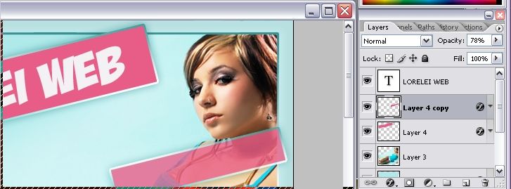
This is what we got…
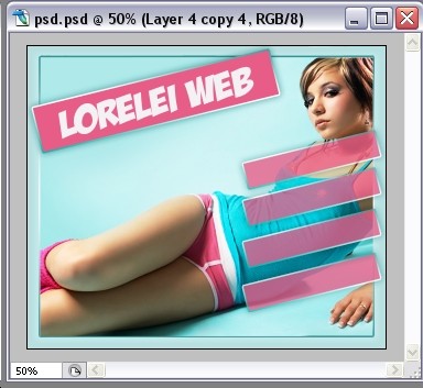
Now, again, same like with the header, add text to each button of your layout…
Now to the main body.
Make a new Layer. Using the marquee tool, draw a box (not too big) and fill it with white. Set the layers fill opacity to 20%, or even less (depending on how dark your photo is)
Press Ctrl + T in order to rotate the box…
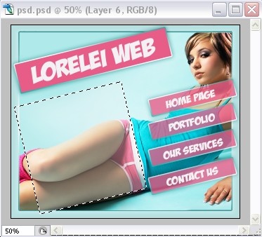
While the are is still selected, switch to the layer where the girl is (the photo) and apply Gaussian blur effect:
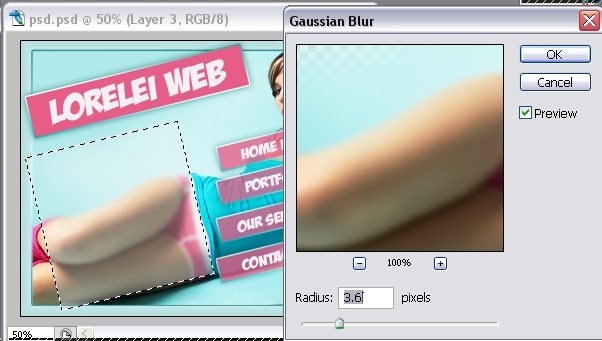
Go to Layer >> Layer Styles >> Stroke, and apply same gradient stroke effect as you did with all the boxes so far, same colours. Adding shadow is optional, we decided not to do it with the text box.

Add text to the newly blurred box, as a new layer, of course.
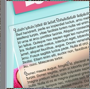
Now, for the final touch, select the Elliptical Marquee tool, and select an area that will “seize” both the header and the pale box for the text…
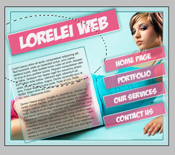
Using the Dodge Tool, with 60% exposure, go over the edges of the selected area, in order to make something like this…

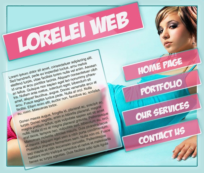
That’s it, this is your final result, just slice and code! This would be ideal for a funky and artistic splash page of any kind.

Pages: 1 2





Nice tut, but if I may critique a little bit.
The type in the main body of text is not contrasting and difficult to read due to the translucency with the girls legs in the background.
Maybe an old caption trick may fix that by adding a white hard glow around the text.
Any how. nice work.
I like this alot gotta use it, thanks!