Are you looking to add a touch of authenticity to your graphic designs? Consider incorporating some rustic graphic design elements. These assets can add unique character and a vintage feel to your work, making it stand out from the crowd. In this article, we will explore seven must-have rustic graphic design elements that can help you create captivating and authentic designs.
Key Takeaways:
- Adding natural elements can give your designs a rustic feel
- Vintage typography can evoke a sense of nostalgia and charm
- Hand-drawn illustrations bring a sense of uniqueness and authenticity to your designs
- Distressed textures can add character and a vintage feel to your designs
- An earthy color palette can transform your designs into rustic masterpieces
- Organic shapes add a touch of imperfection and uniqueness to your designs
- Vintage textures can enhance the rustic vibe of your designs
Embrace Nature: Incorporating Natural Elements into Your Design
Congrats! You made it to the second section of this article where we’ll explore how to incorporate natural elements into your designs for that rustic touch.
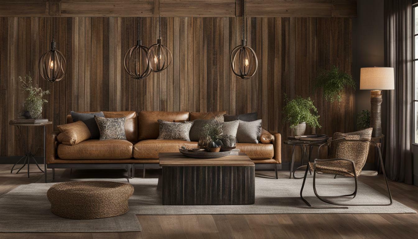
Nature is the best source of inspiration when it comes to rustic graphic design. Think earthy colors, wood and stone textures, and flora and fauna patterns. By using natural elements, you can create designs that are visually appealing and authentic.
Here are some tips on how to incorporate natural elements into your designs:
- Use earthy colors like greens, browns, and oranges to create a natural color palette that speaks to the rustic theme.
- Utilize wood and stone textures as background layers or overlay them on top of other elements for added depth and texture to your designs.
- Incorporate leaf, animal, and other organic patterns into your designs to bring a touch of nature and authenticity.
Remember, natural elements don’t have to take over your designs; they can be subtle additions that enhance the overall aesthetic.
So, go ahead and embrace nature in your next design project. You’ll be surprised at how these small touches can make a big impact on your finished product.
Vintage Typography: Channeling Nostalgia in Your Designs
Are you tired of bland and generic designs? Want to add a touch of nostalgia and charm to your graphics? Look no further than vintage typography.
Using vintage fonts and styles can transport your designs back in time, giving them a rustic and timeless aesthetic. But how do you choose the right typography to achieve this look?
| Tip | Description |
|---|---|
| Research | Start by looking at typography from the era you’re trying to evoke. Take note of the styles, shapes, and textures that were popular at the time. |
| Contrast | Consider pairing vintage typography with modern design elements to create a unique and eye-catching contrast. |
| Simplicity | Avoid overwhelming your designs with too many fonts and styles. Stick to a few key elements to keep the focus on your message. |
“Vintage typography is like a fine wine, it gets better with age.”
Don’t be afraid to experiment with different vintage fonts and styles. Play around with lettering, spacing, and textures to find the perfect balance for your design.
Most importantly, have fun with it! Vintage typography can add a playful and whimsical touch to your graphics, so let your creativity run wild.
- Use typography from the era you’re evoking
- Pair vintage typography with modern design elements
- Keep it simple
With these tips, you’ll be channeling nostalgia and creating rustic designs in no time.
Hand-Drawn Illustrations: Adding a Personal Touch
Are you tired of the same old stock graphics and illustrations? Do you want to add a personal touch to your designs and make them stand out? Look no further than hand-drawn illustrations!
Hand-drawn illustrations can bring a unique and authentic vibe to your designs. Whether you draw them yourself or incorporate existing hand-drawn elements, these illustrations can make your work truly one-of-a-kind.
The great thing about hand-drawn illustrations is that they don’t need to be perfect. In fact, their imperfections are what make them so charming and interesting. So, don’t worry if your lines aren’t straight or your circles aren’t perfectly round. Embrace the quirks and let your creativity flow!
To add hand-drawn elements to your designs, start by sketching out your ideas on paper. Then, scan your drawings into your computer and use editing software to refine and enhance them. You can also incorporate hand-drawn illustrations from other artists, as long as you have permission and give credit where credit is due.
“Hand-drawn illustrations can bring a unique and authentic vibe to your designs. Whether you draw them yourself or incorporate existing hand-drawn elements, these illustrations can make your work truly one-of-a-kind.”
Adding hand-drawn illustrations to your designs can be especially effective for projects with a rustic feel. From simple sketches of flowers and leaves to more detailed illustrations of animals and landscapes, hand-drawn elements can add a personal and organic touch to your work.
So, if you want to take your designs to the next level and infuse them with authenticity, try incorporating hand-drawn illustrations. Your audience will appreciate the personal touch and you’ll stand out from the sea of stock graphics.
Distressed Textures: Creating a Worn and Weathered Look
Congratulations, you’ve made it to the section on distressed textures! This is where the real magic happens in achieving that authentic rustic look. Distressed textures can give your designs a worn and weathered appearance, adding character and depth.
There are various techniques you can use to create distressed textures. One option is to scan in old paper or fabric and use it as a texture overlay. You can also create your own distressed textures using brushes in graphic design software like Adobe Photoshop or Illustrator.
| Distressed Texture Tips: |
|---|
| Incorporate subtle texture: Don’t go overboard with the texture as it can be distracting. Keep it subtle and minimal. |
| Experiment with blending modes: Overlay or Soft Light blending modes can create a great distressed effect. |
| Combine with other elements: Distressed textures work well with vintage typography and hand-drawn illustrations to create a cohesive, rustic look. |
Remember, the key is to aim for a natural look – imperfections are what make it authentic. So embrace the cracks, scratches, and stains to create a realistic aged appearance.
“Distressed textures are like wrinkles – they add character and charm.”
With these tips and tricks, you can create stunning designs with distressed textures. So go ahead and give it a try – your designs will thank you for it.
Earthy Color Palette: Infusing Rustic Tones into Your Designs
Are you tired of using the same old colors in your designs? Switch things up by exploring earthy tones to achieve a rustic look and feel. From warm browns to deep greens, an earthy color palette can give your work a naturalistic vibe that’s perfect for rustic graphic design.
The key to using earthy colors in your designs is finding the right balance. Too much brown and your work may feel drab, too much green and it may appear too busy. Experiment by mixing and matching different tones to find the perfect combination.
| Earthy Colors | Hex Code |
|---|---|
| Brown | #8B4513 |
| Green | #008000 |
| Tan | #D2B48C |
| Beige | #F5F5DC |
Pro Tip: Use the 60-30-10 rule when incorporating an earthy color palette into your design. The dominant color should cover 60% of the design, the secondary color should cover 30%, and the accent color should cover the remaining 10%.
By using earthy colors, you can add warmth and depth to your designs while also creating an authentic rustic feel. So don’t be afraid to embrace these colors and elevate your work to the next level.
Organic Shapes: Embracing Imperfections in Design
Perfection is overrated. Embrace imperfection by incorporating organic shapes into your rustic graphic designs. These shapes can add a unique and raw vibe to your designs, making them stand out from the crowd.
Organic shapes are naturally occurring shapes found in the world around us. Think of the curves of a leaf or the irregular shape of a rock. By incorporating these shapes into your designs, you can create a sense of movement and flow that keeps the eye engaged.
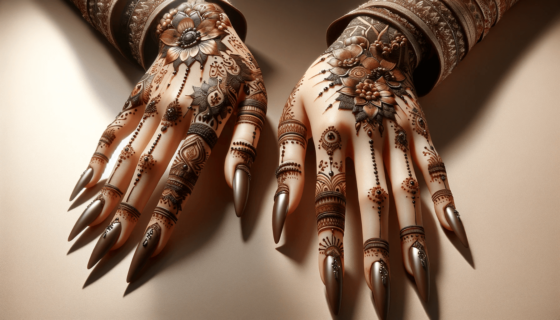
One way to incorporate organic shapes is to use hand-drawn illustrations. Drawings that are not meant to be perfectly symmetrical or straight can give your designs a sense of warmth and authenticity. You can also use tools like Adobe Illustrator to create and manipulate organic shapes digitally.
Another method to embrace organic shapes is to use a template or stencil. This allows you to create uniform shapes with an organic feel. You can also combine different shapes to create a more intricate design.
Remember, imperfection is what makes things interesting. Don’t be afraid to try something new and break away from the norm. Adding organic shapes to your rustic graphic designs is an excellent way to showcase your creativity and add a unique touch to your projects.
“Perfection is not attainable, but if we chase perfection we can catch excellence.” – Vince Lombardi
Vintage Textures: Enhancing the Rustic Vibe
If you want your designs to have a truly rustic feel, vintage textures are a must-have element. These textures can add depth, character, and a sense of nostalgia to your graphics. Here are some tips on how to incorporate vintage textures into your designs:
1. Overlay textures: You can create vintage textures by overlaying different textures on your design. This technique can help you achieve a worn and weathered look that is synonymous with rustic design.
2. Use vintage-inspired patterns: You can also incorporate vintage-inspired patterns into your design. These patterns can create a sense of nostalgia and give your designs a unique character.
Experiment with different textures
Vintage textures come in many different forms, from distressed paper to old wood grain. Experiment with different textures to see which ones work best for your design. Play around with blending modes and opacity levels to create unique effects.
Don’t overdo it
Vintage textures can be a powerful design tool, but it’s important not to overdo it. Too many textures can make your design look cluttered and overwhelming. Use textures sparingly and strategically to create a cohesive and visually appealing design.
With these tips, you can use vintage textures to enhance the rustic vibe of your designs. Incorporate these textures into your work and see how they can add depth, character, and unique charm to your graphics.


