
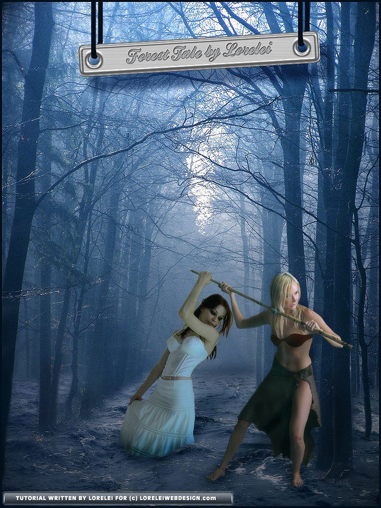
make sure the girl’s image is selected, and go over the edges of her skirt, making them darker. This will create the feeling of the fabric is wet, which makes sense as she stands in the water and also creates an organic shade, allowing her to blend in nicely.

While using the same Burn Tool with the same settings, go to the water layer and make a few shadows around it.
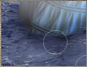
Also, draw a shade falling “from” her body on the water, use your imagination or copy what we did:

Using the burn tool and a much smaller brush, you can also go over the very edge of her skirt and make it darker in a way that will disallow people to see the exact edge of the skirt, this is a very old yet incredibly useful trick to hide poorly cropped layers’ edges.

here is what you’ve got so far, it’s pretty impressive and looks nice.

Time to play around with the second image we have in stock, also crop it and place it on the canvas. Here is a tricky part, you have to place it in a way that will allow the girl in white to grab the stick our blond girl is holding… See?

Also use the Burn tool (yes, again!) draw a shadow from our new layer on the waterscape.

This is what we have achieved so far. Also, needless to add that you have to remove the small portion of the stick that falls ON the white girl’s hand IF you placed the layer on top of her and not underneath. Basically, it doesn’t really matter as long as you achieve the right result. Since we don’t have that many layers here, their sequence of them is not crucial..
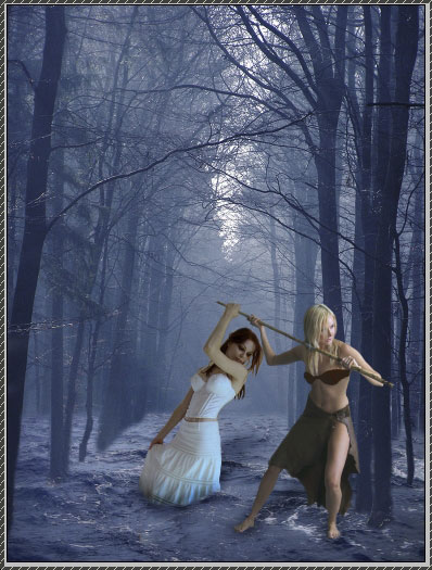
At this point — flatten the layers, all of them.
We are going to work with Levels, so instead of working with layers one by one, we will flatten all of them and work together, it saves a lot of time and hassle.
Go to Levels by pressing Ctrl + L ( or Image >> Adjustments >> Levels) and select the “RED” channel. This is very important because we aim to make the canvas more blueish-green and not just increase the contrast. Once the red channel is selected, draw the dark and white arrows a little bit closer to each other. We are not going to touch the gray arrow, it will remain on “0” since we are not interested in adding red or, on the other hand, fully removing it.

This step will nicely equalize the colors on your canvas, as you can see, the girl’s hair is no longer red — they are in blue shades, and this makes the overall image more organic
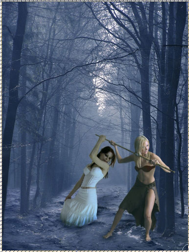
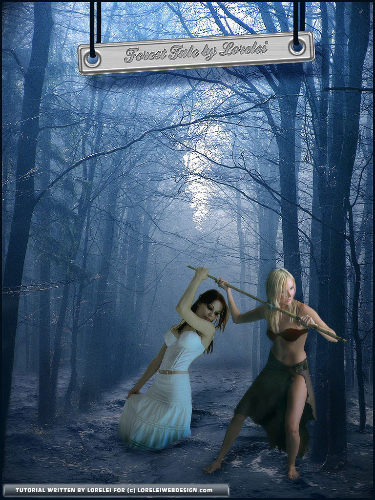
Here is the final result (click on the image to fully view). If you want to be a part of our community, please join our Facebook page and subscribe to our updates via email to ensure you never miss a tutorial or freebie!
Pages: 1 2




I like how you constructed the background, but the female figures look pretty strange tbh. I’m not sure why one woman is submerged and the other isn’t at all?
I totally agree, I don’t like the result myself, but this tut was ready laying in my harddisk and gathering dust, so I thought I will publish it, who knows, some less experienced users might like it.
By the way, I still didn’t thank you I think, it was me who emailed you about the members script — after I had seen how much amember costs I decided to give up on the idea LOL
Thanks anyway for your comment and info!
Nice tutorial , though I have to say it doesn’t look very realistic. The front characters are in high contrast compared to the background image.
yeah, I am afraid that this is just one of the 3 main problems with this tut 🙂
Very cool
Good
Thank you
oh man!!! can u c that a girl it’s taller than the other :))) on has 3 m and the other 1,5 m :))))))) cool i made this mistake when i was 14 years old :))) keep on tryin…..
…like I said, it’s a damn old tut lol, maybe I was 14 back then 😉
you guys are amazing artist..I just use one of the trick and got appreciated by client.thank you very much for sharing your knowledge.smith
lol for your avatar