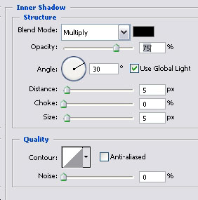
and inner shadow…
Before you press OK, save these settings as a new style, so that layer on, when we would need to make buttons, you will be able to pull it from your sleeve in one second without having to go through all these steps again.
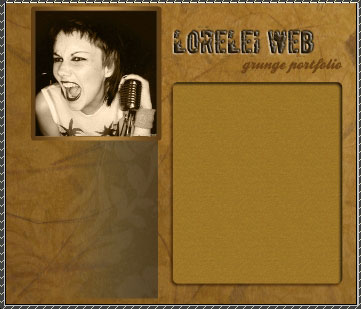
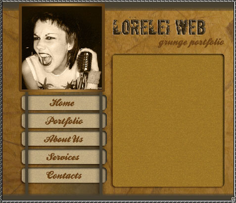
Anyway, here is where you stand at present…
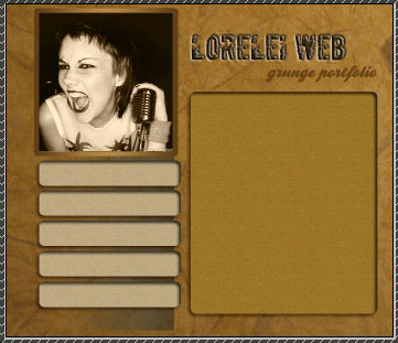
Ok, lets proceed to the buttons. Using same Rounded rectangular tool, draw 4 or 5 buttons. on the left column of the page. We made it easier and after having created one button, just duplicated the layer and dragged it down a bit… then duplicated it and dragged it even more down… this would guarantee all your buttons will be of the same size. Apply the style you saved after making the text box for each button, only I’d recommend to make it lighter.
Using the same handwriting font and #603f12 colour, add text to each of your buttons…
Make a new layer. Select the brush tool, Harsh Round 9px, #484131 colour, and draw to lines above the buttons.
One will cover the line where you made the gradient effect earlier, and the other will just be symmetrical and “hold” the buttons. Look what we did on the pic below to get a better idea. Using the Eraser tool, remove any remains in case your line went over the box with girl’s picture.
Remember that these two lines have to be a separate layer.
So, after you finished making them, go to Layer >> Layer Styles >> Drop Shadow and add this wide range shadow, to make the lines blend nicely with the design… You can use any dark colour for it.
You are almost done, only a few final touches left..
Add a new layer, and select the brush tool. Choose the “Spatter” brush, 59px (comes default in PS CS2). Use the grey color #626262 and draw a line below and above your template… The only thing u have to make sure is that you won’t draw a line over the box with picture. place the new layer below it!

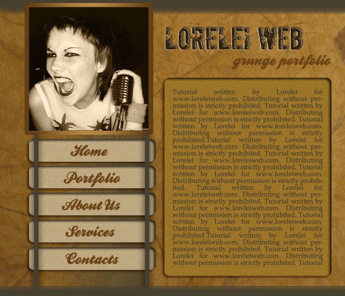
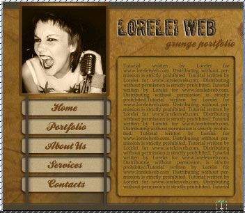
and we got…
All you have left is to add text to your main box…
…and that is it, slice and code!
Hope you enjoyed this tut, because I really enjoyed making it 
