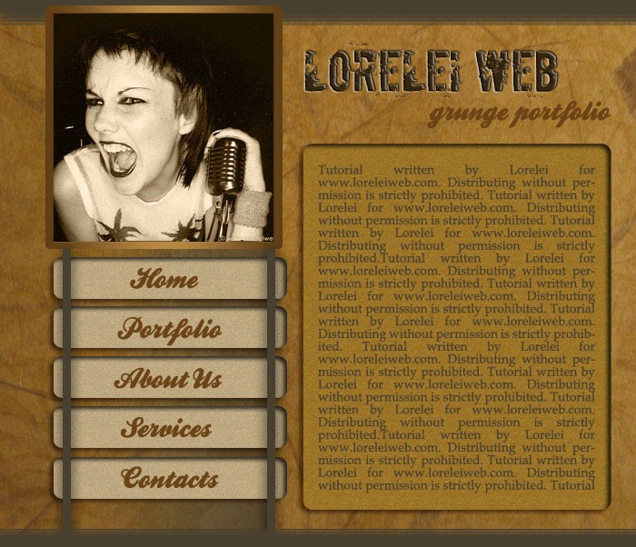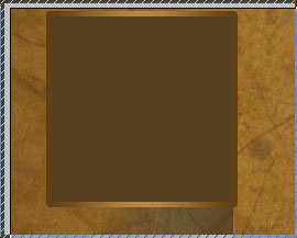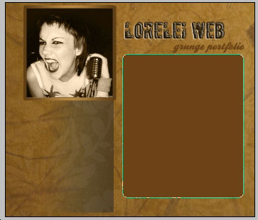
This is what it gave you (you may want to fill the box with some colour for now, but this is not essential as we will overwrite this colour with a photo or picture later.
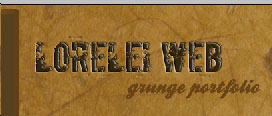
Now, select the typing tool and write the title of your website next to the box, on the grungy background… We used the ‘Boycott’ font and the #31250d colour.
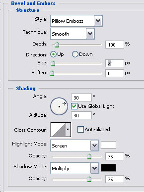
In order to avoid excess of simplicity, go to Layer >> Layer Styles >> Bevel and Emboss and apply these settings, to create the illusion as if the letters were engraved on the texture itself.
So, you got nicely embossed text…
Also, this is optional, but you can add some more text below, preferably in handwriting style font. We used a font called ‘Ballpark’ and the #6d4311 colour.
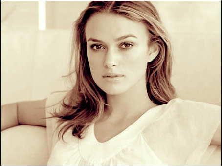
Did this? great! now lets proceed to the box we made before and add a picture to it. I used a photo from here http://www.deviantart.com/deviation/…qh=sort%3Atime Please note that if you use it, you must link back to www.loreleiweb.com and give us credits.
Cut the edges so it will fit perfect into the box (be sure it will lay “above” the box layer) and set the image’s blending option to ‘Luminosity”
Next step is to make the body of the template. Create a new layer and go to ‘shapes’ and select a rounded rectangle tool.
Draw a box as shown on the picture below, fill it with any brown hue of your choice…
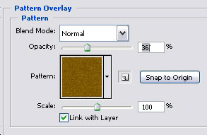
Go to Layer >> Layer Styles >> Pattern Overlay and apply these settings, to give your inner box its own texture filling, yet it shouldn’t be too standing out, because don’t forget – your text goes there!
Add also brown shadow…
