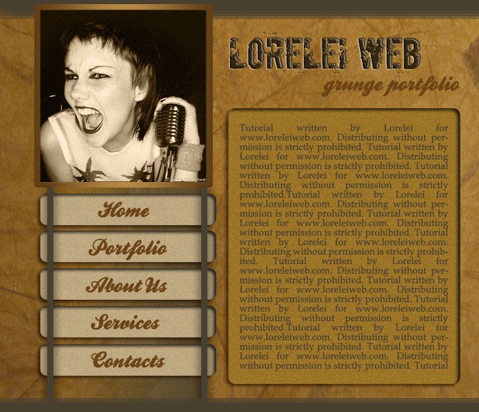
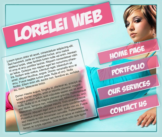
Ok, today you will be making this incredible web layout.. i personally think it’s one of the most professional tuts I have made recently but that is for you to judge.. anyway, here is your result:
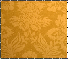
Before you get started, you need some resources, such as grungy texture and photos for the background. We used two images and blended them, first was a fabric texture taken from here .
Create a new canvas, 750*602. Paste your fabric texture unto the canvas.
Since our canvas is very brights, go to Image >> Adjustment >> Brightness / Contrast and reduce both Brightness and Contrast, as shown on the picture below.
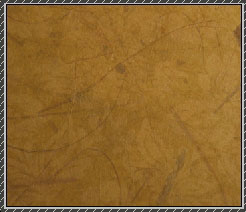
Take some grungy texture. We used a dark paper provided by nighty.
Paste it unto the existing fabric canvas, and set the new layer’s opacity to about 30%.
Opacity may vary, depending on the desired effect. so far, out template’s background interface looks like this:
Select the Rectangular marquee tool, and draw a rectangular as shown on the illustration below:
Now, select the gradient tool, select the gradient – “black to transparent” and draw a line from right to left, so that your box will have a mild gradient as shown below:

Make a new layer. Using the marquee tool again, draw a box at the upper left corner, like this:
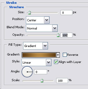
Go to Layer >> Layer styles >> Stroke and apply these settings:
For the gradient effect we used these colours: #603f16 … #c4843a … #603f16
