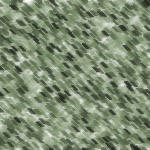
We will be making a texture that imitates the expensive green granite stone. This will be your final result:

Create a new layer, we decided in 150*150 px, but it really is up to you. Fill it with the white colour.

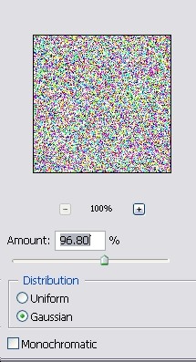
Go to Filter >> Noise >> Add Noise, and add amount of noise as shown on the picture below, as “Gaussian”.

After this, go to Filter >> Sketch >> Chalk & Charcoal, and apply settings as shown on the picture. Be sure to adjust the stroke pressure, to give the image more “depth”.
Click OK. Now your image already looks a bit like an old stone, but we won’t stop here, we will go ahead and polish it.
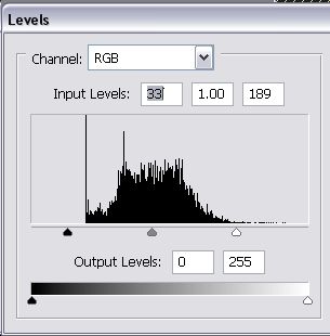
Go to Image >> Adjustments >> Levels… and move the black and white arrows closer to the center, so that they will be “in range” of the main level curve. If you are not sure, just copy the numbers from the screen shot below. I wouldn’t recommend skipping the level correction as it gives the texture a lot more natural contrast and depth which simple contrast adding and brightening cannot achieve.

Pages: 1 2


