Take a render of a beer bottle. I did not have a render so I just went to MorgueFile.com, searched for a beer bottle and cropped. Once you have your beer bottle ready to go on the canvas, paste it unto the layout and place it in the middle of the green line, on the right side, but not too close to the edge. (you may as well use the other Digital Free Photos database)
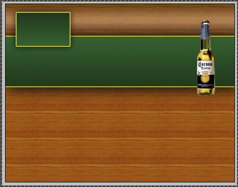
If it does not look organic, add a little, hardly visible shadow to your layer.
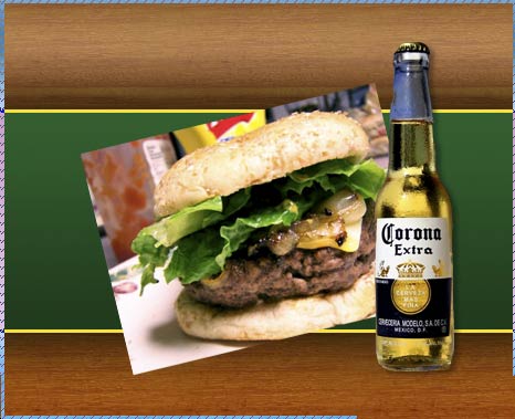
The next step is adding some juicy illustrations. Assuming we are making a template for a bar / restaurant, we will be adding pictures of food. Mine are also pulled from Morguefile.com, if you wish to use the same images, just go there or to Digital Free Photos and search for “hamburger”.Paste the picture of the appropriate size unto the canvas (if it’s too big – just resize it) and place it behind the beer bottle. Press Ctrl + T to rotate it a little, and when you are happy with the angle, hit “Enter”.
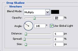
While the layer is still selected, go to Layer >> Layer styles >> options, and apply these settings:
Stroke
Drop Shadow
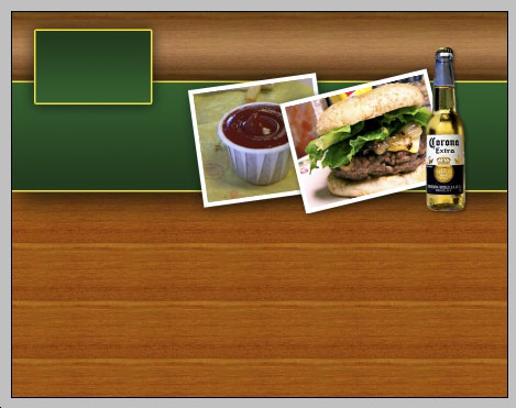
If your layout, just like ours here, is wide – you may want to add one more image, using the same technique.This is your result so far:
Select the Typing Tool. Using the “Caeldera” Font (free, download at UrbanFonts.com), 18 px size and nice beige hue that blends in good with your layout, type the keyword for your navigation menu.

Then – Drop Shadow on text.
Add your logo to the square we made earlier for the logo, if you have a ready to use logo – great, if not – all we did is filling a circle with orange and adding text… aka sunset motif but looks stylish.
Take a photo of some bar or musicians, paste it unto the template so that it will cover the big green box. Remove the remains from yellow border.
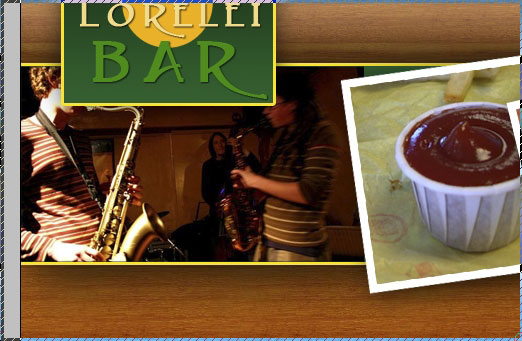
Set the Blending option of the layer to Luminosity (this way the layer will turn green fully), and reduce its opacity to about 25%, or even less if you don’t want your figures on the background to distract too much.

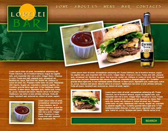
Okay, that is it. Your template is finished. Now all you need to do is slice it and add content! Here is the full size version, don’t forget that if you are a registered member you can download the full size FREE .PSD file. Enjoy!

Pages: 1 2


Thanks for the tutorial . . . . simple and helpful.
Hey,
Thanks for this fantastic tutorial, I’m still trying to figure out how I can sign up to become a member for this site and download the required wood PSD files. Unfortunately I can not seem to find the sign-up section in order to find them anywhere.
Cheers.
hey try to upload video of this tuts and tell a bit more explanation.i could not make ur template.please upload video.
would u please tell me how u place sause image behind burger image and how you place musician image on green bar
Great beat ! I wish to apprentice whilst you amend your site, how can i subscribe for a weblog website? The account aided me a acceptable deal. I had been tiny bit familiar of this your broadcast provided vivid transparent idea
I was recommended this blog through my cousin. I am no longer certain whether this publish is written through him as no one else understand such certain approximately my problem. You’re wonderful! Thanks!
Hi there, You have performed a fantastic job. I will definitely digg it and in my view recommend to my friends. I’m sure they will be benefited from this website.