

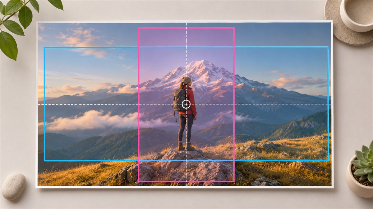
A wide image can look balanced on a desktop and become unusable in a tall phone viewport. The problem is often geometry: the container keeps its height while its width shrinks, and the browser crops the sides to fill it. A “safe area” drawn on the source file is only a guess until you see the theme’s actual crop behavior.
Choose the subject before choosing the crop
Identify the detail a reader needs to see: a person, product, interface control, or visual comparison. Mark that focal point on the source image. Keep a clean area for the heading if text will sit on top. If both the subject and text need the same space at phone width, let the heading move above or below the image instead of forcing an awkward crop.
Preview three real placements
- Article hero: Check the image at the width and height the theme actually displays.
- Archive card: A card may crop more aggressively than the full article. Confirm that the topic remains recognizable.
- Phone viewport: Use the real headline, including its natural line breaks. A longer title may cover the focal point.
Do not assume that the theme will use the source image’s original ratio. Inspect the rendered page. If the same image appears in a social preview, check that crop too.
Pick the right correction
| What goes wrong | First correction |
|---|---|
| Subject cut off at the side | Adjust the image focal point or object-position, if the theme permits it |
| Desktop and mobile need different compositions | Prepare a separate mobile crop and use an art-directed image setup |
| Text becomes unreadable over detail | Move text outside the image or add a stable text surface |
| Image looks soft on a large screen | Check the source resolution and the size served by the theme |
MDN explains that object-fit and object-position control how an image fills and aligns within a box. For genuinely different crops, its responsive-images guide distinguishes art direction with <picture> from merely serving different file resolutions with srcset. Whether those controls are available in WordPress depends on the theme or block implementation; a media-library upload alone does not guarantee a separate mobile composition.
Check the finished page
View the hero at several widths, not only one phone preset. Look for cropped faces or product edges, text over busy detail, and important information embedded in the image that becomes too small. If the image contains essential information, repeat it in accessible page text or an appropriate text alternative. If it is only atmospheric, a simpler crop may be enough.
A hero image should support the article before it decorates the page. The best mobile solution may be a different crop, a different image, or no overlaid text at all.
