A button should tell a visitor what happens next. “Book a consultation” is clearer than “Get started” when the destination is a booking form. Write the label before choosing the shape and color; it determines the width and helps you decide whether the control belongs there at all.
Build the default state first
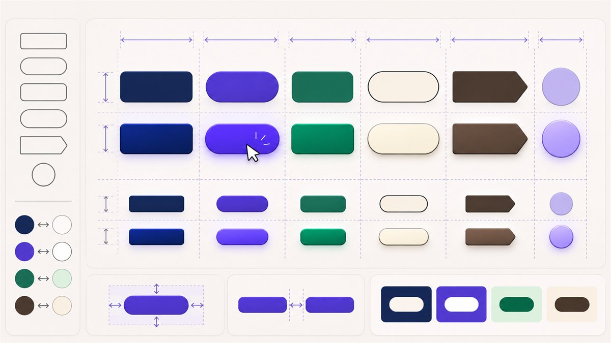
Place the button beside the real heading and body copy. Give the label comfortable space on all sides, without depending on a fixed width that clips translated or longer text. Use a clear fill or border so the control is recognizable, and check the label’s contrast against the button background. The WCAG text-contrast guidance sets 4.5:1 for normal-size text at Level AA, subject to its exceptions.
For pointer targets, WCAG 2.2’s Level AA target-size criterion is at least 24 × 24 CSS pixels, with specific exceptions including sufficient spacing. That is a minimum, not an ideal size for a prominent call to action. Give a primary button more room when the layout allows it, and check the actual clickable area rather than the painted rectangle alone.
Design hover and focus as different states
Hover can signal that a pointer is over the button. A subtle change in fill or border usually works better than an effect that shifts the layout. Keyboard focus has a different job: show exactly which control will activate when a keyboard user activates it. Do not remove the focus outline without providing an equally visible replacement. The W3C focus guidance requires a visible indicator for keyboard-operable controls.
| State | What to inspect |
|---|---|
| Default | Label, text contrast, target size, and visual priority |
| Hover | Visible response without movement that disrupts nearby content |
| Keyboard focus | A distinct visible indicator against the surrounding page |
| Disabled, if used | Reason it cannot be activated and whether the action should instead remain available with an explanation |
Keep the page’s action hierarchy clear
Use the strongest button treatment for the main action in a section. A secondary action can have a quieter treatment or be a text link. If two neighboring controls have identical visual weight, make sure their labels and destinations are genuinely different; otherwise the page is asking visitors to choose between near-duplicates.
In WordPress, the Buttons block lets you edit each button’s text, link, and style. After styling it, tab through the published page with a keyboard and tap the button on a phone. Theme styles can change the final spacing and focus appearance, so the editor preview is only part of the check.
