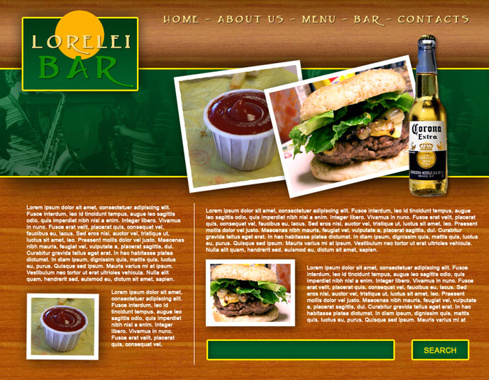
This is the template we will be making today:
So, get started by creating a new canvas, 900*700px.
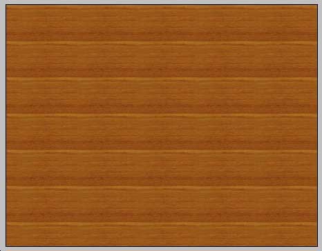
Make a new layer on your canvas and fill it with any wood-like pattern. If you have no wood patterns, download our PSD file.
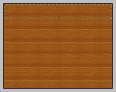
Next, using the rectangular marquee tool, select a strap at the upper part of the template, lets say 140 or 170 pixel high. Make a new layer and fill your selection with any hue of brown.
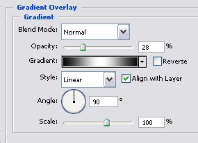
Go to Layer >> Layer Styles >> Gradient and using #000000 … #FFFFFF … #000000 colours, apply the gradient effect with 28% opacity. Make sure to set the Fill of the layer itself to about 30% as well.

Next step. Using the rectangular marquee tool again, select a box under your previous layer, also from side to side, but about two times higher.
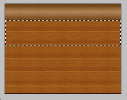
Make a new layer and set your primarily colour to #013814 and your secondary colour to #005e29. Using the Gradient tool, draw a line from the bottom to the top, so that the darker hue will be below.

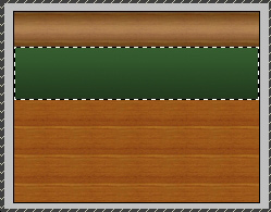
While this layer is still selected, go to Layer >> Layer Styles >> Blending Options and apply the following settlings:
Stroke
Drop Shadow
This is how your canvas should look thus far.

Using the Rectangular Marquee tool, select a box at the left upper corner of your template, as shown on the picture below:
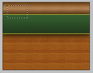
Make a new Layer, and switch to Gradient tool again, this time, using the same green hues as before, draw a line from top to the bottom, so that the darker green hue will be above. This will give the layout a better balance.
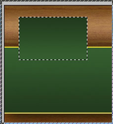
While the later is still selected, go to layer >> layer styles and apply the following settings (same as with the previous box).
Pages: 1 2


Thanks for the tutorial . . . . simple and helpful.
Hey,
Thanks for this fantastic tutorial, I’m still trying to figure out how I can sign up to become a member for this site and download the required wood PSD files. Unfortunately I can not seem to find the sign-up section in order to find them anywhere.
Cheers.
hey try to upload video of this tuts and tell a bit more explanation.i could not make ur template.please upload video.
would u please tell me how u place sause image behind burger image and how you place musician image on green bar
Great beat ! I wish to apprentice whilst you amend your site, how can i subscribe for a weblog website? The account aided me a acceptable deal. I had been tiny bit familiar of this your broadcast provided vivid transparent idea
I was recommended this blog through my cousin. I am no longer certain whether this publish is written through him as no one else understand such certain approximately my problem. You’re wonderful! Thanks!
Hi there, You have performed a fantastic job. I will definitely digg it and in my view recommend to my friends. I’m sure they will be benefited from this website.